Database Reference
In-Depth Information
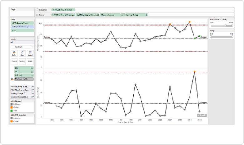
The final rigorous control chart is shown in
Figure 7-15
.
Figure 7-15. The rigorous control chart showing worldwide earthquake count by year
There are a few new insights we can glean from this more rigorous approach:
▪ Both 2009 and 2011 are statistical outliers: they are above the upper control limit for this
time period.
▪ 2012 and 2013 represent a shift in the data: they are the ninth and tenth points all on one
side of the average line (higher).
▪ The drop in earthquake count from 2011 to 2012 was a statistically significant
change
in
the number of annual earthquakes, further highlighting the extraordinary amount in 2011,
largely accounted for by the crisis in Japan that year.
If we change from
YEAR
to
MONTH
, then we see a number of other statistically significant out-
liers and shifts, but no trends, as shown in
Figure 7-16
.
Control charts have a broad application to anything that can be thought of as a process.
Creating control charts in Tableau is a great way to track that process and be alerted to sig-