Database Reference
In-Depth Information
— Trends (six or more points either all ascending or all descending)
— Shifts (nine or more points either all above or all below the average line)
How to Create a Control Chart in Tableau
Now that we've got the basics covered, let's see how it's done using two different meth-
ods—the
quick method
and the
rigorous method
. The difference between the two is how the
control limits are calculated. The quick method uses what's called a
global measure of dis-
persion
, or the standard deviation of all of the points. The rigorous method uses a
local
measure of dispersion
, called Sigma(x), which is derived from the differences between suc-
cessive data points.
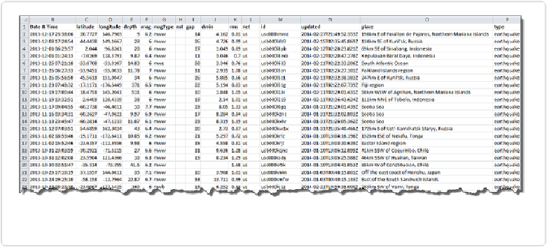
For the next few pages, we'll take into consideration the total number of earthquakes recor-
ded worldwide that registered magnitude 6.0 or higher on the Richter scale from 1983
through 2013. The source for the data is the
USGS Earthquake Archive Search website
.
There were 4,136 such events recorded, and
Figure 7-6
gives a view of the most recent re-
cords in the data set.
Figure 7-6. Sample of global earthquakes data set, registering magnitude 6.0 or greater
The quick method
Create a simple timeline with a
YEAR(Date & Time)
on the Columns shelf, and
SUM(Number
of Records)
on the Rows shelf, fit to width as shown in
Figure 7-7
.