Database Reference
In-Depth Information
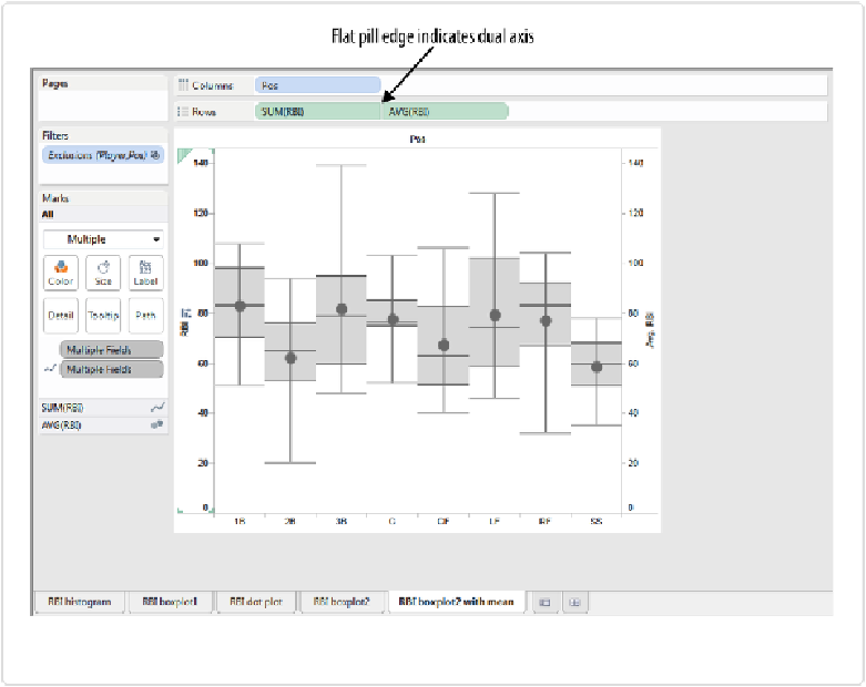
Figure 6-9. Using the synchronized dual axis to add average points to the dot plot
We can now compare the mean, median, first and third quartiles, and maximum and minim-
um RBI values for each of the eight positions, all in one compact view.
Just like the bullet graph, the box plot is a very dense chart type, conveying a lot of informa-
tion in a visual encoding that isn't very difficult to learn. That's why it's such a popular chart
type among statisticians and engineers trying to understand the central tendency and vari-
ation of multiple groups of data.
Next, let's consider how we can communicate central tendency when the distribution doesn't
fit neatly into a normal distribution.