Database Reference
In-Depth Information
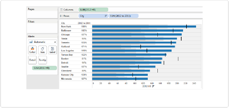
Figure 5-17. Bullet graph of AL team home runs, 2012 to 2011
What has Tableau done here? It has created a simple blue bar chart, in which the lengths of
the bars are proportional to the amount of home runs hit by each team in 2012. It has also
created a vertical line to each row, and color bands to facilitate easy comparison.
How do we read the bullet graph? If the blue bar goes beyond the black line, then the team
hit more home runs collectively in 2012 than they did in 2011. If the blue bar falls to the left
of the black line, then the team hit fewer home runs, and their 2012 tally falls into one of
three bands:
▪ The darkest gray band is for teams that hit less than 60% of their previous year total
(none fall into this leftmost band).
▪ The next lighter gray band is for teams that hit between 60% and 80% of their previous
year total (again, none did).
▪ The final band is for teams that hit between 80% and 100% of their previous year total.
This time, we find four teams in this region: the Rangers, the Red Sox, the Tigers, and
the Indians.
Let's look at how these helpful reference lines and bands are created.