Database Reference
In-Depth Information
plt.bar(pos, y_axis_normed, width, color='lightblue')
plt.xticks(rotation=30)
fig = matplotlib.pyplot.gcf()
fig.set_size_inches(16, 10)
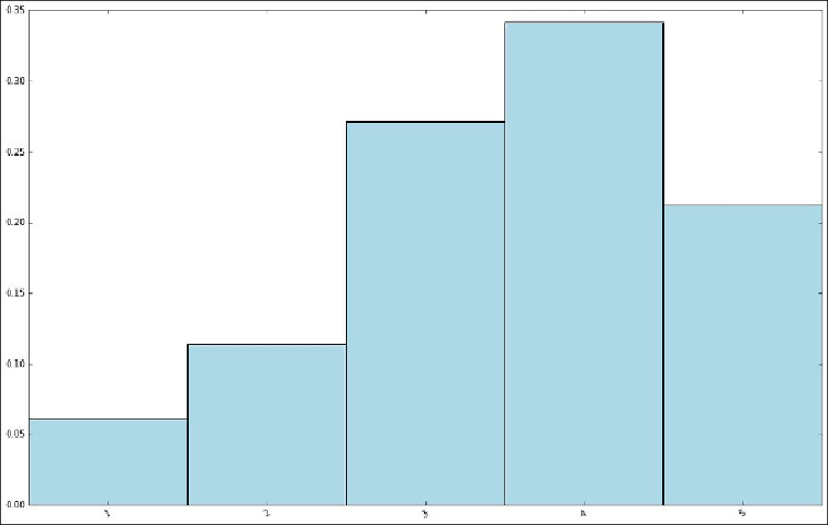
The preceding code should produce the following chart:
Distribution of rating values
In line with what we might have expected after seeing some summary statistics, it is clear
that the distribution of ratings is skewed towards average to high ratings.
We can also look at the distribution of the number of ratings made by each user. Recall
that we previously computed the
rating_data
RDD used in the preceding code by