HTML and CSS Reference
In-Depth Information
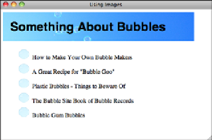
FIGURE 18.23
DO:
Better use of
images.
Watch Out for Assumptions About Your Visitors'
Hardware
Many web designers create problems for their visitors by making a couple of careless
assumptions about their hardware. When you're developing web pages, be kind and
remember that not everyone has the same screen and browser dimensions as you do.
Just because that huge image you created is narrow enough to fit in your browser doesn't
mean that it'll fit in someone else's. An image that's too wide is annoying because the
visitors need to resize their windows or scroll sideways.
18
Most developers limit the overall width of their pages to 750 pixels or 950 pixels, and for
the sake of readability, limit the width of containers used to display text to 500 or 600
pixels. Pages meant to be displayed on mobile devices need to be even smaller.
Be Careful with Backgrounds and Link Colors
Using CSS, you can use background colors and patterns on your pages and change the
color of the text. This can be tempting, but be careful. Changing the page and font colors
and providing fancy backdrops can quickly and easily make your pages entirely unread-
able. The following are some hints for avoiding these problems:
Make sure you have enough contrast between the background and foreground
(text) colors
—Low contrast can be hard to read. Also, light-colored text on a dark
background is harder to read than dark text on a light background.
n
Increasing the font size of all the text on your page can sometimes make it
more readable on a low-contrast background
—You can use CSS
g
to increase
the default font size for your page.
n