HTML and CSS Reference
In-Depth Information
You can also use both styles together to keep the size of your page within a certain
range, regardless of the size of the user's browser window:
#container { min-width: 600px; max-width: 800px; }
Normally elements in HTML are sized to fit the content that is placed within them.
However, if you constrain the size of an element with a size or a maximum size and then
place content inside the element that won't fit, the browser has to decide what to do with
it. By default, when content won't fit inside its box, the browser just displays the over-
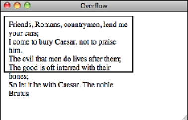
flow as best it can. As you can see from Figure 8.10, the results are not always pretty.
8
FIGURE 8.10
Content that is
too large for its
container.
The border shows the dimensions of the box specified in the style sheet. Because there's
too much text to fit inside the box, it runs over the border and down the page. Using the
CSS
overflow
property, you can tell the browser what to do when these situations arise.
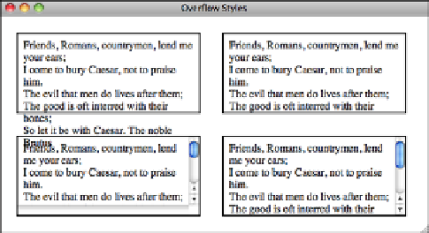
The values are
visible
(this is the default),
hidden
,
scroll
,
auto
, and
inherit
. You can
see how the different overflow settings look in Figure 8.11.
FIGURE 8.11
Different ways
of dealing with
overflow.