Graphics Reference
In-Depth Information
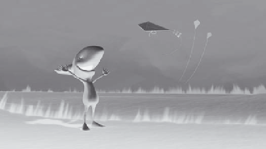
In
The Kite
, texture is used to support the idea of fl ight. In an otherwise sparse envi-
ronment, wisps of grass constantly blow in the wind as a subtle reminder of what the
character is trying to achieve: to fl y a kite.
Grass in the landscape reinforces the concept of fl ight.
The Kite
,
Gwynne Wheeler, Ringling College
of Art and Design
Color.
Some colors that we use in a scene are dictated by what is called local color.
These are colors that have natural associations. Grass is green; the sky is blue; the
wood fl oor is brown, etc. Other colors are used to create emotion through visceral,
psychological, or cultural associations. For example, green is associated with nature,
growth, and rebirth. But it can also mean lack of experience, good luck, greed, envy,
jealousy, or sickness. How can one color generate such a range of possibilities? The
range of emotion often has to do with the value or saturation of the color. Yellow-green
connotes sickness. Dark green is the color of ambition. Pure green symbolizes healing,
safety, and nature. Colors have fi nite emotional associations. Reds and yellows are
warm. Greens and blues are cool. Grays are neutral. Good design requires that you
understand the range of emotion that a color can create so you can apply it thought-
fully in your work.
Red—warmth, richness, power, excitement, eroticism, romance, anxiety, anger
Orange—hot, healthy, exuberant, exhilarated, ambitious, fascinated, exotic, roman-
tic, toxic
Yellow—happy, energy, joy, innocence, caution, cowardice
Green—vital, successful, healthy, fertile, safe, inexperienced, jealous, ominous,
poisonous, corrupt
Blue—stable, calm, dependable, tranquil, loyal, sincere, passive, melancholy, cold
Purple—wise, dignifi ed, independent, mysterious, mystical
White—innocent, good, pure, clean, cold
Black—elegant, formal, strong, authoritative, powerful, dangerous, evil, grief,
death