Biomedical Engineering Reference
In-Depth Information
72
1
10
100
1000
180
0.63
=
(t-t
o
) data
100
=
=
Original data
80
0.1
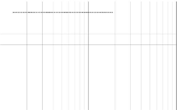
Figure 12.7
Weibull plot for modified data (
t
-
t
o
).
used. The other, rather sneaky, benefit is that it tells you when you need to service the device.
Say that you know your device is used, on average, 10 times a month. This suggests that you
should be contacting your end-user to suggest a service after 70 uses, or 7 months. A good
way to keep your end-users happy is to get a sales advisor in to talk to them and avoid any
breakdowns before they happen!
12.3.4 Measles Chart
The measles chart is a good way of keeping track of complaints and defects. It is so
simple it is beyond comparison, but it is so powerful you will not regret beginning to use
it. It is a simple sketch of the device, and every time you receive a complaint, or detect a
nonconformity or defect, you plot this on the picture.
Figure 12.8
is a sketch of a device. The sketch consists of two diagrams.
Figure 12.8(a)
illustrates the sketch of the device when the data collection begins. It is devoid of
information. However,
Figure 12.8(b)
shows what it looks like after several months.
Every time a complaint was received an X was placed over the source of the problem.
This diagram shows that there have been eight complaints - not too bad, but not too good
either. The power of this diagram is that it
shows
that there is a real problem with one of
the dials.
I cannot stress how powerful this diagram is. Its power comes from the simplicity of its use
and then the visual power of the analysis.


Search WWH ::

Custom Search