Java Reference
In-Depth Information
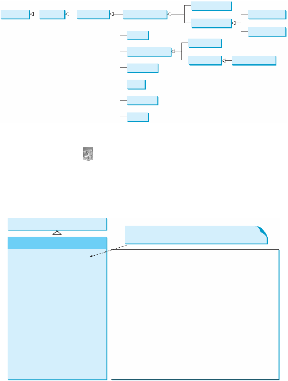
JButton
Component
Container
JComponent
AbstractButton
JCheckBox
JToggleButton
JRadioButton
JLabel
JTextArea
JTextComponent
JTextField
JPasswordField
JComboBox
JList
JScrollBar
JSlider
F
IGURE
12.14
These Swing GUI components are frequently used to create user interfaces.
Note
Throughout this topic, the prefixes
jbt
,
jchk
,
jrb
,
jlbl
,
jtf
,
jpf
,
jta
,
jcbo
,
jlst
,
jscb
, and
jsld
are used to name reference variables for
JButton
,
JCheckBox
,
JRadioButton
,
JLabel
,
JTextField
,
JPasswordField
,
JTextArea
,
JComboBox
,
JList
,
JScrollBar
, and
JSlider
.
naming convention for
components
A
button
is a component that triggers an action when clicked. Swing provides regular buttons,
toggle buttons, check box buttons, and radio buttons. The common features of these buttons
are defined in
javax.swing.AbstractButton
, as shown in Figure 12.15.
AbstractButton
javax.swing.JComponent
The
get
and
set
methods for these data fields are provided
in the class, but omitted in the UML diagram for brevity.
javax.swing.AbstractButton
-actionCommand: String
-text: String
-icon: javax.swing.Icon
The action command of this button.
The button's text (i.e., the text label on the button).
The button's default icon. This icon is also used as the “pressed” and
“disabled” icon if there is no pressed icon set explicitly.
The pressed icon (displayed when the button is pressed).
The rollover icon (displayed when the mouse is over the button).
The mnemonic key value of this button. You can select the button by
pressing the ALT key and the mnemonic key at the same time.
The horizontal alignment of the icon and text (default: CENTER).
The horizontal text position relative to the icon (default: RIGHT).
The vertical alignment of the icon and text (default: CENTER).
The vertical text position relative to the icon (default: CENTER).
Indicates whether the border of the button is painted. By default, a regular
button's border is painted, but the borders for a check box and a radio
button are not painted.
The gap between the text and the icon on the button.
The state of the button. True if the check box or radio button is selected,
false if not.
-pressedIcon: javax.swing.Icon
-rolloverIcon: javax.swing.Icon
-mnemonic: int
-horizontalAlignment: int
-horizontalTextPosition: int
-verticalAlignment: int
-verticalTextPosition: int
-borderPainted: boolean
-iconTextGap: int
-selected: boolean
F
IGURE
12.15
AbstractButton
defines common features of different types of buttons.