Graphics Reference
In-Depth Information
Much controversy has surrounded the issue of the comparative
legibility of serif and sans serif typefaces. One argument claims
that serif text type is more readable because the serifs reinforce the
horizontal flow of each line. Serif typefaces also offer more character
definition: for example, the serif on the bottom horizontal stroke
of a capital
E
accentuates the difference between it and a capital
F
.
However, the relative legibility between serif and sans serif typefaces is
negligible. Reader familiarity and the control of other legibility factors
(to be discussed later) are far more significant than the selection of a
serif or sans serif typeface. (See the type specimens in Chapter 13 to
compare the legibility of serif and sans serif type.)
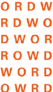
3-8
Word recognition is
based on word structure,
a combination of word
shape (defined by the
contours of the letters)
and internal word
pattern. The word set
in lowercase letters is
more distinct than the
word set in all capitals,
because its irregular
word shape makes it
more recognizable.
The nature of words
While individual letters as discrete units, affecting all other spatial and
aesthetic considerations, are the basis for a discussion of legibility, one
reads and perceives words and groups of words, and not just letters. In
discussing typographic legibility, Frederic Goudy observed that “a letter
may not be considered apart from its kinsmen; it is a mere abstract and
arbitrary form far remote from the original picture or symbol out of
which it grew, and has no particular significance until it is employed
to form part of a word.” There are two important factors involved
in the reading process: word shape and internal pattern. Words are
identified by their distinctive word shapes, strings of letters that are
instantaneously perceived, permitting the reader to grasp content easily
(Fig.
3-8
). Counterforms create internal word patterns that provide
cues for word recognition.
When these internal spaces are altered sufficiently, the
perceptual clarity of a word may also be altered. The weight of letters
is vital to word recognition and influences an adequate internal
pattern. The combination of word shape and internal pattern creates
a word structure, an all-inclusive term describing the unique
composition of each word (Fig.
3-9
).
3-9
Letters can be
grouped in myriad
combinations. Words
that are perceived as
having meaning are
those with which we
have become familiar
over time. They form
a distinct and familiar
shape.
3-10
Misfit letter
combinations and
irregular spacing can be
a problem, particularly
for display type. Optical
adjustments should be
made to achieve spatial
consistency between
elements.