Graphics Reference
In-Depth Information
2-45
2-46
Elaborations of Helvetica Medium.
Angle.
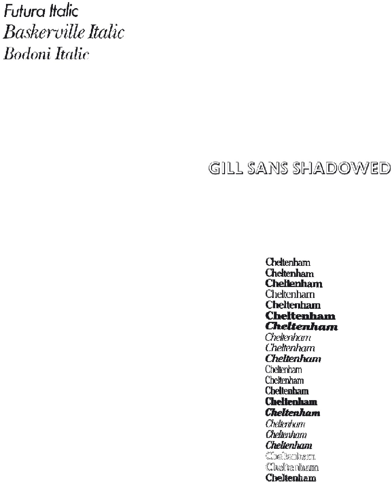
In our discussion about the basic classification of
typefaces, italics were presented as a major independent category.
They were first introduced four hundred years ago as a new style.
Now italics serve as a member of type families, and they are used
for contrast or emphasis. Italic fonts that retain curvilinear strokes
inspired by handwriting are called cursives or scripts. In geometric
typefaces constructed with drafting instruments, the italic fonts
created by slanting the stroke angle are called obliques. Baskerville
Italic (Fig.
2-45
) is a cursive, demonstrating the influence of
handwriting; Futura Italic is an oblique face; and Bodoni Italic has
both cursive and oblique qualities. Although the Bodoni family was
constructed with the aid of drafting instruments, details in the italic
font (for example, some of the lower serifs) evidence a definite
cursive quality.
Elaboration.
In design, an elaboration is an added complexity,
fullness of detail, or ornamentation. Design elaboration can be used
to add new typefaces to a type family. These might include outline
fonts, three-dimensional effects, and the application of ornaments to
letterforms. Some of the variations of Helvetica (Fig.
2-46
) that are
available from the German firm of Dr. Boger Photosatz GmbH include
outlines, inlines, perspectives, rounded terminals, and even a chipped
antique effect.
While many elaborations are gaudy and interfere with the
integrity and legibility of the letterforms, others can be used
successfully.
Gill Sans Shadowed (Fig.
2-47)
is based on Gill Sans. A black
shape, suggesting dimensionality, is placed behind each letter.
Decorative and novelty typestyles should be used with great
care by the graphic designer. At best, these can express a feeling
appropriate to the content and can allow for unique design solutions.
Unfortunately, the use of design elaboration is often a mere straining
for effect.
2-47
The Cheltenham family
One of the most extensive type families is the Cheltenham series of
typefaces (Fig.
2-48
). The first version, Cheltenham Old Style, was
initially designed around the turn of the century by architect Bertram
G. Goodhue in collaboration with Ingalls Kimball of the Cheltenham
Press in New York City. When this typeface went into commercial
production at the American Type Founders Company, designer Morris
F. Benton supervised its development. Benton designed about eighteen
additional typefaces for the Cheltenham family. Variations developed
by other typefounders and manufacturers of typesetting equipment
expanded this family to more than thirty styles. The design properties
linking the Cheltenham family are short, stubby slab serifs with
rounded brackets, tall ascenders and long descenders, and a moderate
weight differential between thick and thin strokes.
2-48