Graphics Reference
In-Depth Information
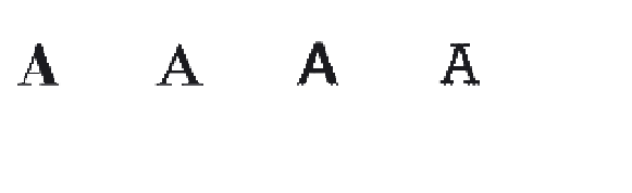
Thick/thin contrast
This visual feature refers to the relationship
between the thinnest parts of the strokes in
letters and the thickest parts. The varying
ratios between these parts produce a wide
range of visual textures in text type (Fig.
2-31
).
2-31
high
medium
low
no
contrast
contrast
contrast
contrast
x-height
As it is based on the height of lowercase
letters without ascenders or descenders,
x-height can vary immensely in different
typefaces of the same size. Typically, x-heights
are considered “large” when they are at least
two-thirds the height of capital letters. They
are “small” when they measure one-half the
height of capital letters (Fig.
2-32
).
2-32
extra large
large
medium
small
extra small
Ascenders/descenders
Ascenders and descenders may appear longer
in some typefaces and shorter in others,
depending on the relative size of the x-height.
Descenders are generally slightly longer than
ascenders among letters of the same typeface
(Fig.
2-33
).
2-33
extra long
long
medium
short
extra short
Stress
The stress of letters, which is a prominent
visual axis resulting from the relationships
between thick and thin strokes, may be left-
angled, vertical, or right-angled in appearance
(Fig.
2-34
).
2-34
left-angled
vertical
right-angled