Graphics Reference
In-Depth Information
Unity of design in the type font
Tremendous diversity of form exists in
the typographic font. Twenty-six capitals,
twenty-six lowercase letters, ten numerals,
punctuation, and other graphic elements
must be integrated into a system that can
be successfully combined into innumerable
words.
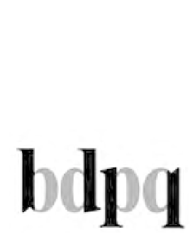
Letterform combinations from
the Times Roman Bold font (Fig.
2-26
)
demonstrate visual similarities that bring
wholeness to typography. Letterforms share
similar parts. Repeated curves, verticals,
horizontals, and serifs are combined to bring
variety and unity to typographic designs
using this typeface. All well-designed type
fonts display this principle of repetition
with variety that is demonstrated in Times
Roman Bold.
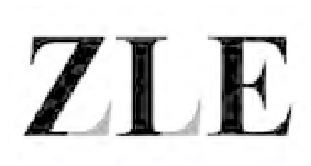
2-26
Curved capitals share a
common round stroke.
The diagonal strokes of
the
A
are repeated in
V
W
M
. Lowercase letters
have common serifs.
F E B
demonstrates that
the more similar letters
are, the more common
parts they share. Repe-
tition of the same stroke
in
m n h u
t
creates unity.
Likewise, the letters
b d p q
share parts.
Capital serifs recur in
similar characters.
Subtle optical adjust-
ments can be seen. For
example, the bottom
strokes of the capital
Z
and
L
have longer serifs
than the bottom stroke
of the
E
. This change in
detail compensates for
the larger counterform
on the right side of the
first two letters.