Graphics Reference
In-Depth Information
2-13
Proportions of the letterform
The proportions of the individual letterform
are an important consideration in typography.
Four major variables control letterform
proportion and have considerable impact
upon the visual appearance of a typeface: the
ratio of letterform height to stroke width; the
variation between the thickest and thinnest
strokes of the letterform; the width of the
letters; and the relationship of the x-height
to the height of capitals, ascenders, and
descenders.
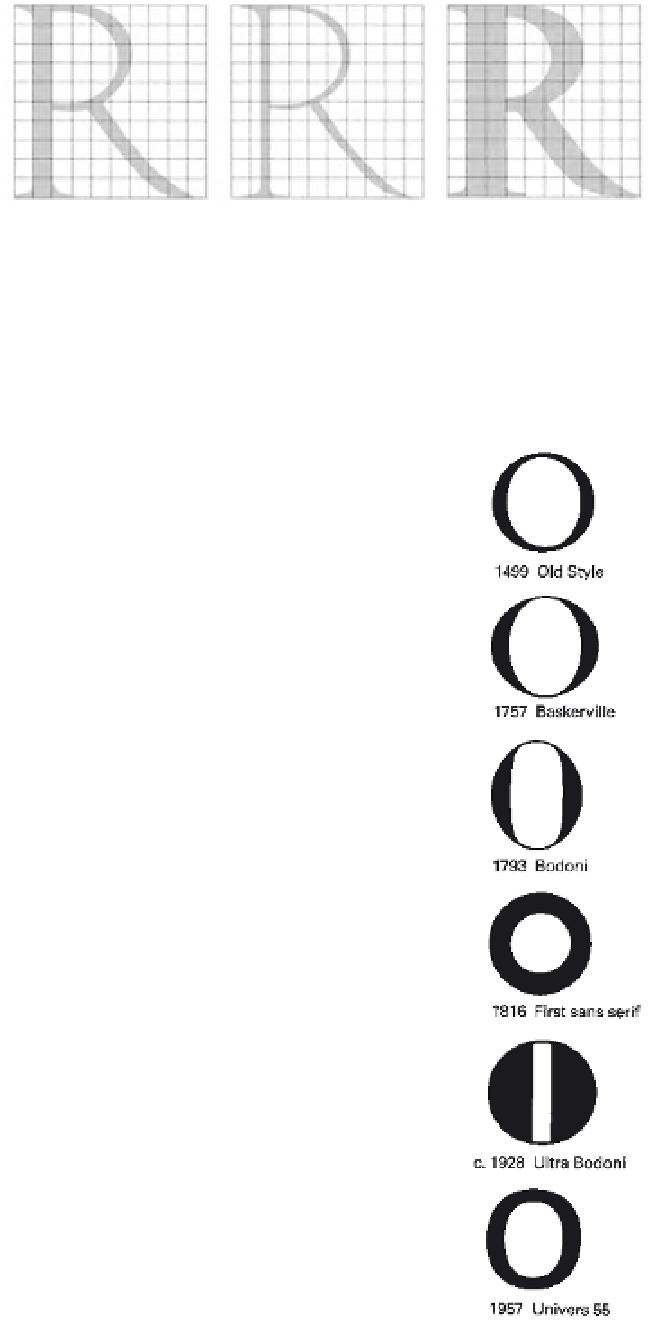
Stroke-to-height ratio.
The roman
letterform, above, has the stroke-width-to-
capital-height proportion found on Roman
inscriptions (Fig.
2-13
). Superimposition
on a grid demonstrates that the height of
the letter is ten times the stroke width. In
the adjacent rectangles, the center letter is
reduced to one-half the normal stroke width,
and the letter on the right has its stroke width
expanded to twice the normal width. In both
cases, pronounced change in the weight and
appearance of the letterform occurs.
Contrast in stroke weight.
A change in
the contrast between thick and thin strokes
can alter the optical qualities of letterforms.
The series of
O
's in Figure
2-14
, shown with
the date of each specimen, demonstrates how
the development of technology and printing
has enabled typeface designers to make
thinner strokes.
In the Old Style typography of the
Renaissance, designers attempted to capture
some of the visual properties of pen writing.
Since the writing pens of the period had
a flat edge, they created thick and thin
strokes.
Stress
is the term used to define
this thickening of the strokes, which is
particularly pronounced on curves. Note how
the placement of weight within the Old Style
O
creates a diagonal axis. As time has passed,
type designers have been less influenced by
writing.
By the late 1700s, the impact of writing
declined, and this axis became completely
vertical in many typefaces of that period.
In many of the earliest sans serif typefaces,
stress disappeared completely. Some of these
typefaces have a monoline stroke that is
completely even in weight.
Expanded and condensed styles.
The design qualities of a typographic font
change dramatically when the widths of
the letterforms are expanded or condensed.
The word
proportion
, set in two sans serif
typefaces, demonstrates extreme expansion
and condensation (Fig.
2-15
). In the top
example, set in Aurora Condensed, the
stroke-to-height ratio is 1 to 9. In the bottom
example, set in Information, the stroke-to-
height ratio is 1 to 2. Although both words
are exactly the same height, the condensed
typeface takes up far less area on the page.
x-height and proportion.
The
proportional relationship between the
x-height and capital, ascender, and descender
heights influences the optical qualities of
typography in a significant way. The same
characters are set in 72-point type using three
typefaces with widely varying x-heights
(Fig.
2-16
). This example demonstrates how
these proportional relationships change the
appearance of type. The impact of x-height
upon legibility will be discussed in Chapter 3.
2-14
2-15
2-16
On the same-size body
(72 point), the x-height variation
between three typefaces—
Garamond 3, Bodoni, and Univers—
is shown. The proportion of the
x-height to the point size significantly
affects the appearance of type.


