Graphics Reference
In-Depth Information
LETTERFORMS ANALYZED
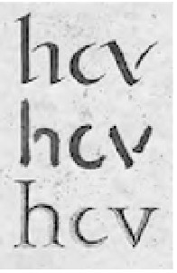
2-1
Strokes made with
a reed pen (top), with a
brush (middle), and with
a chisel (bottom).
The four timelines in Chapter 1 graphically present the evolution of
letterforms and typographic design from the beginning of writing to
the present. Our contemporary typographic forms have been forged
by this historical evolution. Typography evolved from handwriting,
which is created by making a series of marks by hand; therefore, the
fundamental element constructing a letterform is the linear stroke.
Each letter of our alphabet developed as a simple mark whose visual
characteristics clearly separated it from all the others.
The marking properties of brush, reed pen, and stone engraver's
chisel influenced the early form of the alphabet (Fig.
2-1
). The reed
pen, used in ancient Rome and the medieval monastery, was held at an
angle, called a cant, to the page. This produced a pattern of thick and
thin strokes. Since the time of the ancient Greeks, capital letterforms
have consisted of simple geometric forms based on the square, circle,
and triangle. The basic shape of each capital letter can be extracted
from the structure in Figure
2-2
, which is composed of a bisected
square, a circle, a triangle, an inverted triangle, and two smaller circles.
The resulting vocabulary of forms, however, lacks several
important attributes: optically adjusted proportions, expressive design
properties, and maximum legibility and readability. The transition
from rudimentary marks to letterforms with graphic clarity and
precision is a matter of design.
Because early capital letters were cut into stone, these letters
developed with a minimum number of curved lines, for curved strokes
were difficult to cut (Fig.
2-3
). Lowercase letters evolved with reed-pen
writing. Curved strokes could be written quickly and were used to
reduce the number of strokes needed to write many characters.
The parts of letterforms
Over the centuries, a nomenclature has evolved that identifies
the various components of individual letterforms. By learning
this vocabulary, designers and typographers can develop a
greater understanding of and sensitivity to the visual harmony
and complexity of the alphabet.
In medieval times, horizontal guidelines were drawn to
contain and align each line of lettering. Today, letterforms and
their parts are drawn on imaginary guidelines to bring uniformity
to typography. All characters align optically on the baseline.
The body height of lowercase characters aligns optically at
the x-height, and the tops of capitals align optically along the
capline. To achieve precise alignments, the typeface designer
makes optical adjustments.
Figures
2-4
to
2-12
identify the major components of
letterform construction.
2-4
Capline
Meanline
x-height
Baseline
Beard line
Capline:
An imaginary line that runs along the tops of
capital letters and the ascenders of lowercase letters.
Meanline:
An imaginary line that establishes the
height of the body of lowercase letters.
x-height:
The distance from the baseline to the
meanline. Typically, this is the height of lowercase
letters and is most easily measured on the lowercase
x
.
Baseline:
An imaginary line upon which the base of
each capital rests.
2-2
2-3
Capital and
lowercase letterform
construction.
Beard line:
An imaginary line that runs along the
bottoms of descenders.