Graphics Reference
In-Depth Information
SANS SERIF
Franklin Gothic
Univers
Meta
Futura
Additional sans serif fonts
Sans serif typefaces have elemental
letterforms stripped of serifs and decorations.
Although sans serifs first appeared early in
the nineteenth century, their use accelerated
during the 1920s. “Form follows function”
became the design dictum, and the functional
simplicity of sans serif typefaces led many
designers to look upon them as the ideal
typographic expression of a scientific and
technological century.
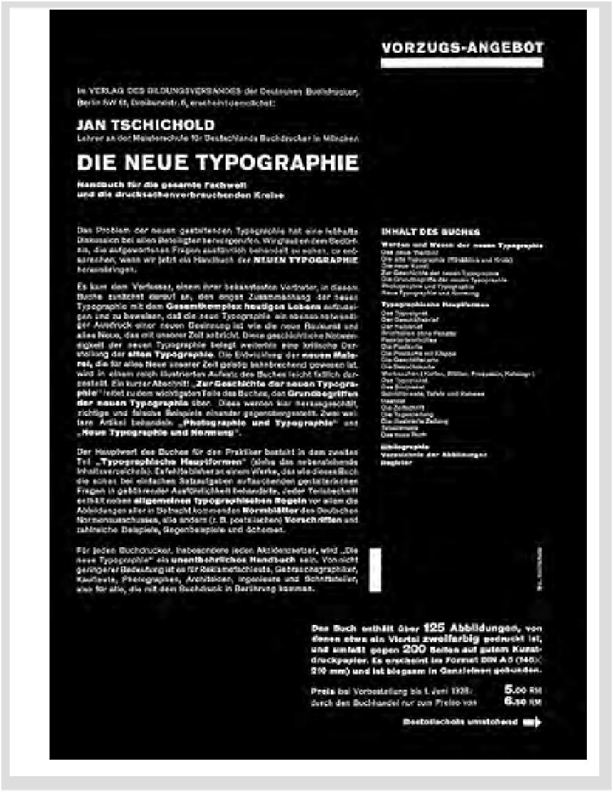
In Jan Tschichold's influential book
Die neue Typographie
, he advocated a new
functional style for a rational era. In the
prospectus for the topic, he used sans serif
type as an expression of the age (Fig.
13-2
).
The page also demonstrates asymmetrical
balancing of elements on a grid system, visual
contrasts of type size and weight, and the
importance of spatial intervals and white
space as design elements.
During the 1950s, Univers and Helvetica
were both designed as more contemporary
versions of Akzidenz Grotesque, a German
turn-of-the-century sans serif. Compare the
text setting and the display specimens of
Helvetica with their Univers counterparts.
There are subtle differences in the drawing
of many letterforms. The Univers family is
renowned for its remarkable graphic unity,
which enables the typographic designer to
use all twenty-one fonts together as a flexible,
integrated typographic system.
Sans serif typefaces, like serif typefaces,
have distinct visual attributes and can be
further classified as Grotesque, Neo-grotesque,
Humanist, or Geometric (see Chapter 2).
13-2
Prospectus designed by Jan Tschichold for his
book
Die neue Typographie
, 1928.