Graphics Reference
In-Depth Information
Expressive typography:
form amplifies message
Type as metaphor
Douglas Higgins
Warren Lehrer
University of Cincinnati
SUNY Purchase
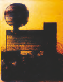
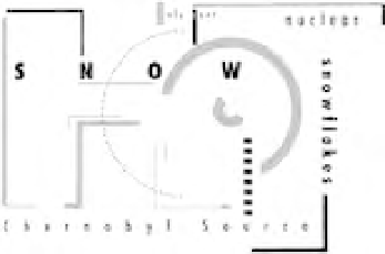
Design students explored the potential of
software techniques to intensify typographic
messages. Content derived from scientific
newsletters was used to create typographic
identifiers that clearly summarized factual
information contained in the article. By
employing a source of subject matter that is
usually designed routinely, the temptation to
appropriate a solution was minimized.
Special attention was given to the role
of visual hierarchy and typographic contrast
while developing drafting skills useful in
professional practice. The ease with which
the computer generated variations facilitated
visual refinements (Fig.
11- 83
).
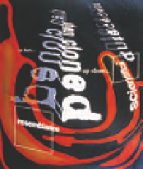
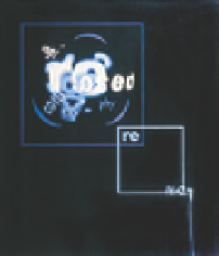
Students investigated a subject, and then,
working with one to three primary texts,
they developed four panels that approach
typography as metaphor. The first panel
was composed of paragraphs, sentences,
and phrases; the second panel, individual
words; the third panel, syllables; and the
last panel, individual letters. Through
research, critical thinking, mind mapping,
and experimentation, students gave
form to metaphoric implications through
compositional arrangement, juxtaposition,
and typographic manipulation. Design
students were pushed beyond utilitarian,
overliteral, or preordained approaches to
typography (Fig.
11- 8 4
and
11- 85
).
This project is a variation of the Type as Metaphor
project by Mike Schmidt (University of Memphis),
which was inspired by Andrew Blauvelt.
11-84
Designer: Kerry De Bruce
11-83
Designers: University of Cincinnati juniors
11-85
Designer: Nakyoung Sung