Graphics Reference
In-Depth Information
CASE STUDY
A typographic program for the
17th Street Farmers' Market
10-41
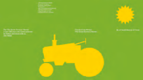
The bold, vector-based tractor silhouette,
straightforward spatial composition, and vivid
color are characteristics that became the defining
elements of the market's graphic program.
The 17th Street Farmers' Market in the Shockoe Bottom district
of Richmond, Virginia, was one of America's first public markets.
It originated as an outdoor market around 1737 and was officially
established in 1779. The first structure on the site was an open wooden
shed, replaced two years later with a brick building and colonnade.
The market expanded in the following years, and by 1854 a larger
brick building—the First Market House—was built on the corner
of 17th Street and Main. During the Civil War, this building served
as a strategic gathering place for Confederate soldiers. Later in the
war, Union troops occupied it as barracks. After the war and into the
1900s, the market prospered; but by the mid-twentieth century the
Shockoe Bottom district had declined and the market could no longer
be sustained. The First Market House was demolished in the 1960s.
The market was again revived in the 1980s, and the current open-air
pavilion was built during this time.
In recent years, the market has thrived as a vital center for
community events, and as a venue for farmers, artists, flea and antique
dealers, and bakers to sell their products.
The current success of the 17th Street Farmers' Market is largely
attributable to a visionary period of time when the market's manager
departed from the conservative thinking of the city officials and the
advisory board to embrace the power of forward-thinking graphic
design and typography.
Initially, John Malinoski was asked to design a poster for one of the
market's events. The poster proved so successful that it soon became the
pilot project for the market's identity and the inspiration for developing
the graphic program (Fig.
10-41
). The visual language of the program
is based on compelling ideas and bold, iconographic forms rather than
what might be considered the obvious market vernacular—nostalgic
photographs and engravings laden with obvious period typography. The
silhouetted icon of the farm tractor serves as the market's identity mark
and as a central unifying element in posters, postcards, bumper stickers,
and various other printed materials (Fig.
10-42
).
Malinoski can be considered a second-generation modernist who
pays allegiance to the universal principles of rationality, simplicity,
and visual economy. He nurtures these ideals like a dedicated parent,
but does so with wit, humor, and intelligence. It is possible that
several visits to Holland contributed to shaping his design vision, for
Dutch design has street presence and is a reflection of the processes
and pragmatics of everyday living. Malinoski adheres to the idea that
understatement is the most potent statement.
10-42
The sun sets on a horizon of aligned text
type in this implied farm landscape.


