Graphics Reference
In-Depth Information
Each of the 101 metropolitan areas is shown consistently,
using the same organizational structure. The designers began with a
geographically projected world map and zoomed into each area to
establish a 162 x 130 kilometer framework and a 1:750,000 scale.
This means that 1 centimeter on the map corresponds to 7.5
kilometers on the ground. For comparison purposes, each map has
the same scale, grain, frame, and legend. Grain adjusts in density
according to elevation. The legend indicates bodies of water, land
area, land elevation, railways, motorways, built-up areas, airports,
and seaports. A concentration of contrasting orange on these maps
indicates built-up areas.
The statistical data for each metropolitan area are displayed
next to each map using two methods: as diagrams, and as figures and
text. The diagrammatic display shows proportions in relation to the
maximum value that a given characteristic of the region can reach:
a small orange dot represents a relatively low value, and a large dot
a relatively high value. Maps appear on the right-hand page of the
spread, while statistical information appears on the left, enabling
readers to seamlessly lip through the topic to compare one area to
another (Fig.
10-39
).
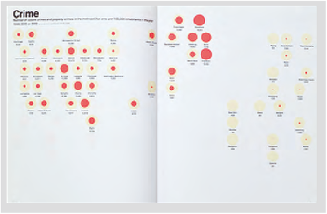
The second section of the atlas (Fig.
10-40
) compares data for the
metropolitan areas on a global perspective by topic. Dots representing
the areas are positioned on simplified world maps. The size of dot
or, in some cases, the colored pie-chart percentage of the dot refers to
regional values in relationship to specific data. Readers can compare
areas in terms of passenger airports, flight movements, telecom ports,
population, built-up areas, average temperatures, and income per
capita, among others.
The design of the
Metropolitan
World
Atlas
provides an
extraordinary typographical reference work for comparing the
differences and similarities of metropolitan regions from varying
perspectives.
10-40