Graphics Reference
In-Depth Information
Station signage consists of forty-one signs in a typical station
configuration. Station identification bands run parallel to the tracks at
a consistent height of 2.2 meters from the platform floor. This creates
a 220-meter “perpetual belt,” through the interiors of the stations. The
station name repeats every 2.5 meters, helping riders to readily identify
their stops from within the trains (Fig.
10-30
).
Ronald Shakespear attests that signs are “active expressions
of identity that go beyond just giving directions and solving basic
circulation and communication problems.” They must integrate into
the surrounding environment and contribute to a sense of place.
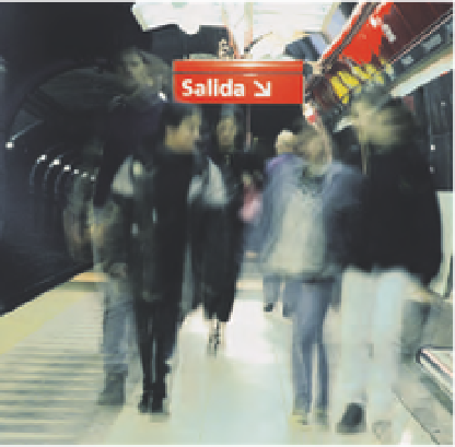
Observations revealed critical psychological concerns—for
example, the express need for riders to leave the underground
environment as soon as possible. As Shakespear puts it, “The exit sign
is the most important symbol to people on the subway: How do you
escape? It is unnatural to be underground in the city.” (Fig.
10-31
).
Frutiger was selected as the system typeface, not only for its
superb legibility but also for its informal, friendly appearance. Set in
Frutiger Bold, the name
Subte
provides a distinctive word picture for a
memorable brand. Different weights and sizes of Frutiger are applied to
the signage to establish a decipherable information hierarchy. Type was
scaled to optimize readability at various viewing distances.
The final phase of the Subte transformation was the design of
above-ground signage. Since a specific design program had not been
employed in a hundred years, the entrance conditions, including
signage, varied widely. The Shakespear team adapted visual aspects of
the interior signage, but reconfigured them at an appropriate scale to
help travelers identify the six different transit lines.
The circular forms identifying various lines on interior signage
were integrated into illuminated sign boxes as three-dimensional
orbs. Because of their three-dimensional forms and bold colors, these
signs serve as prominent landmarks for Subte stations (Figs.
10-32
to 10-34
). As a major urban feature, the Subte system contributes
enormously to the functionality and ambience of Buenos Aires, and
to the pride of its residents.
10-30
Running the entire length of each station
platform, an information rail typographically repeats
the station name, reassuring travelers of their arrival
destination. The station name is easily viewed while
riding the train.
10-31
Exit signs are
easily identified in the
information hierarchy.
Upon stepping out
of trains, travelers
immediately seek escape
from the underground.