Graphics Reference
In-Depth Information
CASE STUDY
Typographic film titles
Referring to a movie advertisement that used letterforms “painted
by light,” typographic historian Beatrice Warde wrote, “After forty
centuries of the necessarily static Alphabet, I saw what its members
could do in the fourth dimension of Time, 'flux,' movement. You may
well say that I was electrified.” Through advanced animation and
computer graphics techniques, graphic designers are transforming
typographic communication into kinetic sequences that might almost
be called “visual music.”
Richard Greenberg has distinguished himself as a leading
innovator in graphic design for film titles, movie previews, special
effects, and television commercials. He considers film titles to be a
“visual metaphor” for the movie that follows, setting “the
tone
of the
movie. You have to take the people who have just arrived at the theater
and separate them from their ordinary reality—walking onto the street,
waiting in line; you bring them
into
the movie. You want to tell them
how to react: that it's all right to laugh, that they are going to be scared,
or that something serious is going on.”
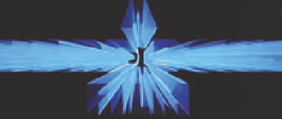
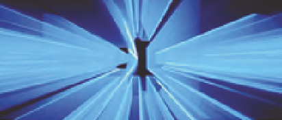
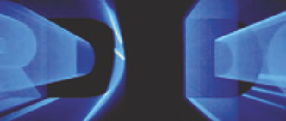
In the titles for the Warner Brothers film
Superman
, bright blue
names and the Superman emblem streak through space like comets,
stop for a moment, and then evaporate into deep space (Fig.
10-19
).
The speed and power of this film's fantasy superhero are evoked. This
effect is accomplished by tracking rear-illuminated typography in front
of an open camera lens. Each frame captures a streak of light that starts
and stops slightly before the light streak recorded on the next frame.
When shown at twenty-four frames per second, this series of still
images is transformed into a dynamic expression of zooming energy.
10-19
Title sequence
for the film
Superman
.
(Designer: Richard
Greenberg)