Graphics Reference
In-Depth Information
10-12
The black bars and consistent typography on
folder covers become a visual identification.
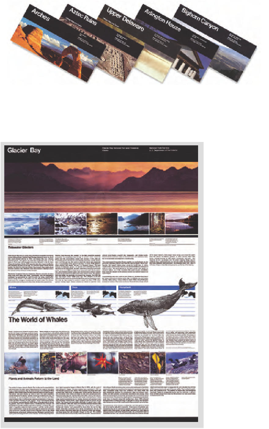
The Unigrid system emphasizes clarity
by clearly separating the elements (Figs.
10 -11
and
10-12
). Type seldom overlaps images,
and maps are not obscured by picture inserts
or overlaps. Neutral grays and beiges, used
to create backgrounds behind text areas or
unify groups of images, are part of a standard
palette of twenty-four colors, created from
four-color process inks and a limited selection
of secondary colors. This color palette creates
continuity between various park publications.
Standardized formats and typographic
specifications enable National Park
Service designers to focus on content and
design, rather than developing formats
and specifications for each project. The
Unigrid system is flexible, permitting
unique solutions appropriate to specific
messages, while leading to consistent
graphic excellence and a unified visual
identification.
Massimo Vignelli was the inventor and
consulting designer for the Unigrid system.
The program gained its vitality because the
original design team remained intact over
the first dozen years, and included Vincent
Gleason (art director), Melissa Cronyn,
Nicholas Kirilloff, Linda Meyers, Dennis
McLaughlin, Phillip Musselwhite, and
Mitchell Zetlin.
10 -11