Graphics Reference
In-Depth Information
CASE STUDY
The U.S. National Park Service Unigrid system
The United States National Park Service (NPS) began developing
the Unigrid system in 1976 as a design system to unify the design of
hundreds of site folders, while bringing harmony and economy to its
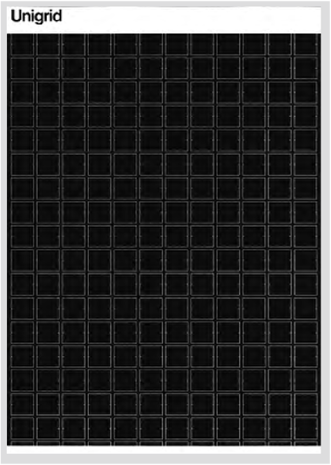
publications program. Unigrid (Fig.
10-8
) is based on a sheet 420 by
594 millimeters (about 16.5 by 23.5 inches), which folds into twelve
panels that are 99 by 210 millimeters (about 4 by 8.25 inches). Ten
basic formats (Fig.
10-9
) can be derived from the Unigrid, ranging
from one-panel leaflets to twelve-panel foldout broadsides. Each side
of a folder is treated as a unified graphic surface that is completely
unfolded by the user, just as one fully opens a map. The fold lines and
the panels they create become background rather than a dominant
structure, because the typical user quickly unfolds it to its full size;
users rarely open a folder panel by panel. These standard formats
permit great production economy because paper can be purchased in
volume in two flat sizes or in web rolls. Most folders are printed in five
of the available formats, further simplifying planning.
Grid modules for the folder formats measure 7 picas wide and
80 points high. Vertical spaces between modules are 1 pica wide;
horizontal spaces between modules are 10 points high. Horizontal
measurements are always made in picas, while vertical measurements
are always made in 10-point units or modules. These spatial intervals
provide a structure for organizing type, illustrations, photographs, and
maps into an orderly whole.
Helvetica was selected as the type family for the Unigrid system
because of “its crisp, clean details and typographic texture that make
it aesthetically pleasing and easy to read.” It was also determined
that Helvetica would strengthen and unify the NPS map series that
accompanies the folder program. Other considerations are Helvetica's
clearly defined hierarchy of sizes and weights with predictable results,
large x-height with good line strength and consistent color, and
outstanding printing characteristics. Text type is usually set in 8/10 or
9/10 Helvetica or Helvetica Medium in columns two or three modules
wide (15 or 23 picas wide, measuring two or three modules plus
spatial intervals between them).
Text type is often justified, and columns are aligned top and
bottom to create horizontal movement. Sometimes the last column
will run short. One line space, rather than an indentation, is used to
separate paragraphs.
10-8
The Unigrid was created by Massimo Vignelli
(consulting designer), Vincent Gleason (art director),
and Dennis McLaughlin (graphic designer).