Graphics Reference
In-Depth Information
CASE STUDY
Integrating type and image in poster design
A remarkable integration of type with image is found in posters
designed by Jean-Benoît Lévy, who has a studio in San Francisco,
California. Lévy collaborates with photographers, approaching their
images as three-dimensional fields whose space is activated and
extended by type. On the last day of class when Lévy was a student,
teacher Armin Hofmann told him to place type
in
the photograph
rather than
on
the photograph. Lévy says, “From that moment on, I
knew what to do.” In his inventive designs, words and images become
a unified composition.
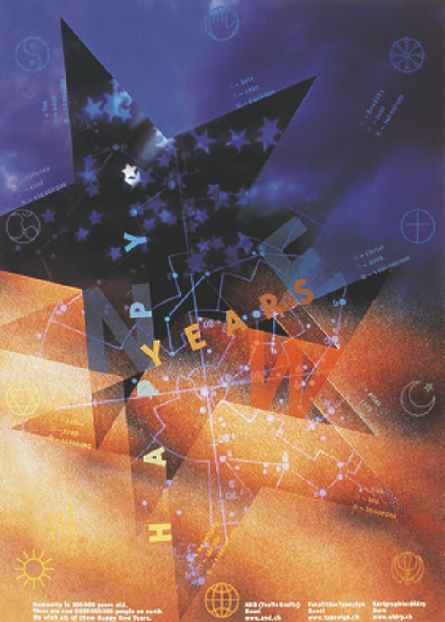
The large star in a “Happy New Years” poster (Fig.
10-1
) for the
Basel studio AND (Trafic Grafic) conveys a sense of energy and motion
through repetition on a diagonal axis. The background transition from
orange to blue signifies earth to sky.
Happy
aligns with the two white
stars, unifying the type and background. The sky is signified in three
ways: symbolic stars; a photograph of clouds; and the lines and dots of
a star chart. Subtle symbols of the world's major religions, and small
type identifying each religion's deity or founder, date, and number
of adherents, add another level of meaning in the bold celebratory
message.
Grid structures for graphic designs are often implied, but in a
poster (Fig.
10-2
) for the fashion store Inflagranti, the horizontal and
vertical pattern of window blinds superimposed with a double portrait
of a fashion model provides a visible structure of the placement of
type. The translucency and graded tones of the vertical store name
echo the translucent portrait and blended tones of the blinds, further
uniting word and image.
The curved forms of watch parts, their shadows, and watch-face
numerals were photographed in atmospheric space for a Montres et
Bijouterie Bosch watch and jewelry store poster (Fig.
10-3
). Widely
letterspaced type set in arcs reflects the curves in the photograph.
Color is used to create harmony, with the yellow, white, and orange
letters repeating the photograph's warm tones in contrast to the
predominantly gray background. Lévy says the orange dots from the
text signify seven planets, with the sun in the exact center.
10-1
Alignment of the type along the angled edges
of the stars unifies word and image. (Designer: Jean-
Benoît Lévy; photographer: Tom Wedell)