Graphics Reference
In-Depth Information
Speed and
duration.
The speed at which type enters a frame
and the length of time it stays on screen can affect legibility. Fluid
movement also makes an animation easier to watch and read. Using
more frames will create more natural movement and greater legibility
of type in motion. Equally important to movement on screen are
pauses in the action. Allowing a viewer to take in all the changing
variables the designer has created is important to clear communication.
Pauses are used to create drama, building anticipation as the viewer
waits for the next frame (Fig.
9-31
). The designer is in control of how
quickly type will be read, and the viewer has to follow text at the pace
the designer sets. This can be uncomfortable for some viewers who are
used to static text, which allows them to read at their own pace and go
back to reread text at any time.
Viewers of type in motion must take in a lot of auditory and visual
information at once—text, images, movement, sound—and process
the combination of signs into meaningful messages. Well-designed
sequences show a careful balance of these elements in each frame,
shot, and scene so as not to overwhelm the viewer. Appropriate timing
of type in motion requires trial and error, and testing with audiences is
encouraged to guarantee legibility.
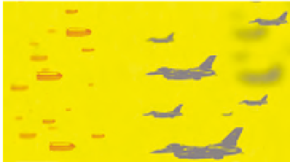
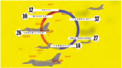
9-31
This animation about political conflict in
Colombia is designed to make it easy for the viewer
to receive information. Images and text are added
gradually, and colored backgrounds cue the viewer
to changes in tone. (Designer: Eduardo Palma)