Graphics Reference
In-Depth Information
USING TYPE IN TIME-BASED MEDIA
Moving type offers unique communication opportunities because it
has two properties: form and behavior. As with static typography, the
designer chooses typeface characteristics (serif, sans serif, extended,
italic, etc.), and how the type is set (lowercase, all caps, size, color,
etc.) to add meaning to a message. With dynamic typography, he or
she also determines how the type moves (pace, rhythm, with sound,
etc.), relying on that action to communicate a mood, a context for the
message, or a hierarchy of information.
For example, to make a word seem important on a poster, the
designer may make it large, bold, and red (Fig.
9-7
). In a motion
sequence, the designer may also animate the large red type so it comes
toward the viewer, increasing in size until it fills the frame (Fig.
9-8
).
To show significant years on an interactive timeline, a designer may
indicate the dates with bold, all-caps text, and animate the numbers so
they grow in size when a user hovers over them.
Another example of this kind of feedback is the subtle animations
and transitions that guide users through mobile app and website
interfaces. Readers rely on both what type looks like and how it moves
to help them interpret the message.
9-7
In this poster for an exhibition at P.S.1, a
museum in New York, bold typography draws
attention. (Designer: Level Design Group)
Time and sequence
An understanding of the principles of animation and film broadens
the potential for designers to communicate and create rich messages
with type in time and motion. Like a film director, the designer is
a storyteller and can control time, sequence, pace, and even sound
to achieve different results. He or she can sequence content in a
straightforward, linear way, with one event following another. Or,
time can be manipulated by changing the order of the story or content
using foreshadowing and flashbacks. As Jean-Luc Godard, the French
New Wave film director, has said, “A story should have a beginning, a
middle, and an end, but not necessarily in that order.”
In all cases, time becomes the structural element of the design
and is enhanced by appropriate choices of typographic forms, images,
movements, and sounds. Different structures and the rhythm of the
action can set a mood and engage viewers by giving them cues as to
what is going to happen next.
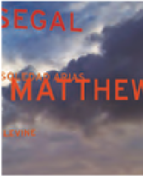
9-8
This motion sequence emphasizes the names of
the artists in the exhibition by moving them toward the
viewer and increasing their size over time. (Designer:
Level Design Group)