Graphics Reference
In-Depth Information
CASE STUDY
Nicholas Davidson Design
Design: Nicholas Davidson
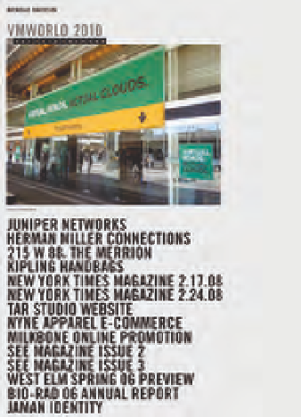
This bold and direct website showcases the
work of designer Nicholas Davidson. The site
opens to a page containing a list of design
projects set in large, tightly spaced capital
letters. Set in Trade Gothic Bold Condensed
No. 20, the scale and dense texture of this
typographical listing makes it the most
dominant element on the page, and its
imposing presence invites visitors to explore
the site (Fig.
8-41
).
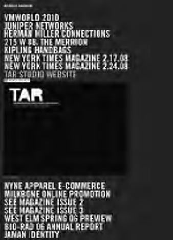
Clicking on the links opens image panels
featuring examples of the projects (Figs.
8-42
and
8-43
). This causes the remainder of the
list to slide down the page, contributing to a
resonant, kinetic effect. Clicking on additional
projects opens new panels while closing
previous ones. Activating the same link a
second time closes a panel.
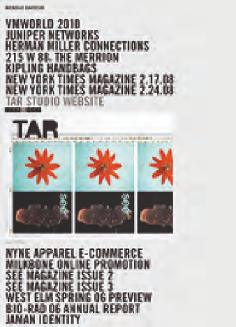
Clicking anywhere on an open panel
slides the current image to the left, revealing
the next in the form of a slideshow. Numerical
tabs at the top of the panels enable visitors to
explore elements of each project in any order
whatsoever.
The interactivity of this website is
appropriately functional, giving visitors
the freedom to fluidly wander through
Davidson's work and to examine its many
aspects in detail.
8-41
8-42
8-43