Graphics Reference
In-Depth Information
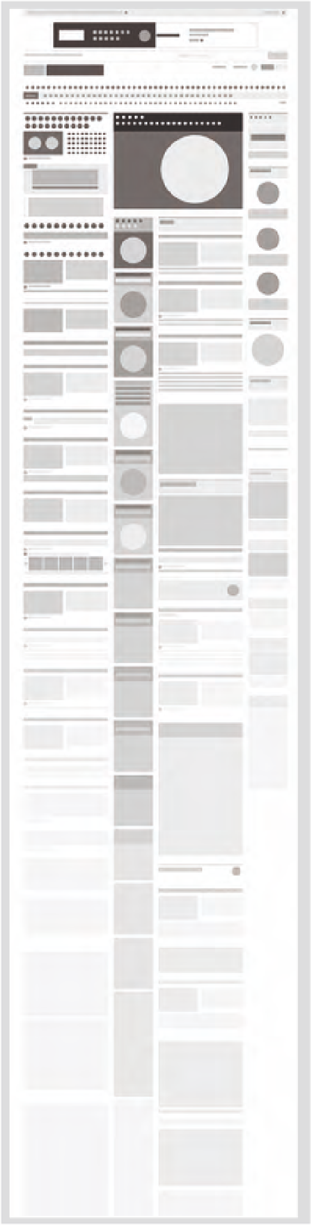
8-22
This abstraction of
layout and information
on a web page illustrates
the symbolic use of type
on screen. (Designer:
Laura Peters)
Units of text
On screen, short paragraphs and the introduction of small units of
text invite readers into the content. Text can be structured with the
goal of bringing clarity and understanding to ideas, and preventing
the monotony of vast seas of text, which severely inhibits the reading
process (Fig.
8-21
).
Further, reading on-screen text begins with a visual scan. By
doing so, a reader gauges the length, relevance, and interest they
have in the information. Properly dividing and articulating units of
text help this process. Thinking of each different type of information,
including headers, subheads, pull quotes, paragraphs, links, buttons,
and so on, as individual symbols and as part of the overall page and
site system brings clarity to each unit's function and establishes clear
hierarchy. Readers then rely on these typographic cues to navigate the
rich array of content on each page as well as throughout the site or
app (Fig.
8-22
).
A traditional style sheet that specifies typeface, size, leading,
line length, letterspacing, etc., for each type of element is an
invaluable aid in building and testing the effectiveness of the
typographic system. The designer can test the mix of typefaces and
make adjustments to promote consistency or contrast.
White space
To break visual uniformity and accentuate units of text, white space
should be increased around and between typographic elements. At a
page level, this includes margins and column gutters. At a column level,
spaces between paragraphs and sections are increased up to 20 percent.
For longer passages of text, white space can be used to visually
mark a reader's progress. Violating the edge of a column with a
different unit of type like a pull quote or an image provides a moment
of visual pause as well as creating dynamic, asymmetrical white space
(Fig.
8-23
).