Graphics Reference
In-Depth Information
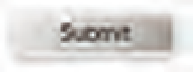
8 -11
Inadequate
resolution of type as
image on hi-res screens
results in pixelation, as
in the SUBMIT button
in this example.
By clicking SUBMIT, you will
complete your order.
Techniques for displaying on-screen fonts
Pixel fonts.
These are typefaces specifically designed as bitmapped
type, which are designed to the pixel; for example, the characters in
Emperor 15 (Fig.
8-9
) are exactly 15 pixels high. On a 72-dpi screen,
these will be the same height as a 15-point typeface, since there are
also 72 points in an inch. On a 96-dpi screen, however, a 15-pixel
tall bitmap font will appear smaller, about the size of 11-point type.
Pixel fonts can degrade when used at larger or smaller sizes than the
size for which they are intended. Each of the specimens shown will
appear more or less legible at different sizes (Fig.
8-10
). On screen,
care must be taken to scale type for optimum legibility. Pixel fonts are
especially useful for very small on-screen text, as they can be designed
to maximize legibility when pixelated. The distinctive appearance
of these fonts has led to their occasional use as display fonts because
their character is expressive of computer technology.
Type as image.
Type, especially display type, is converted
to a picture file format, such as GIF, and downloaded as an image
on a website. The benefits are fidelity to the designer's intent and
compatibility with almost all web browser software. Since images
require more file size than plain text, this slows the downloading
of the web page. Type downloaded as an image is fixed in size and
cannot be selected or copied as text. It cannot be scaled or changed
in size. Revisions are difficult because an image, rather than running
text, must be revised. Image files should be saved at a minimum
of 200 percent of the standard resolution of 72 pixels per inch to
accommodate high pixel-density displays (Fig.
8 -11
). Photoshop
provides preset antialias settings that enable designers generating
type as image to fine-tune the images for improved legibility.
@font-face.
For many years, due to differences in computer
operating systems and browsers, web designers were limited to the
selection of default typefaces installed in computer operating systems.
Also, they have fought with the inability to consistently control the
way type specified for their websites is viewed by users on their
computers. Users can set their own browser preferences, enabling
them to select typefaces, type sizes, font smoothing, colors, and how to
view images. The inconsistent rendering of type across platforms and
browsers remains a problem, but new technologies have emerged that
enable designers to link any number of fonts to their web pages, thus
ensuring that users view pages as intended by the designer.
The introduction of the @font-face feature, for example, allows
designers to link any number of fonts from a third-party URL to
different browsers. Users can be served designer-selected fonts on their
local computer without relying on the limited offerings of their font
library. Services that host or supply web fonts are working with font
designers to develop new typefaces and revivals at a quickening pace.
As web designers gain access to a greater percentage of the world's
font libraries, the need to understand typography from historical,
technological, and communicative perspectives is critical.
8-9
Emperor is a pixel
font with a different
design for display at
different point sizes,
with each pixel equaling
one point. Emperor 19,
for example, is 19 pixels
tall. (Designer: Zuzana
Licko)
8-10
Despite their
inherent simplicity,
abundant variations of
pixel fonts exist, each
with its own expressive
potential.