Graphics Reference
In-Depth Information
7-27
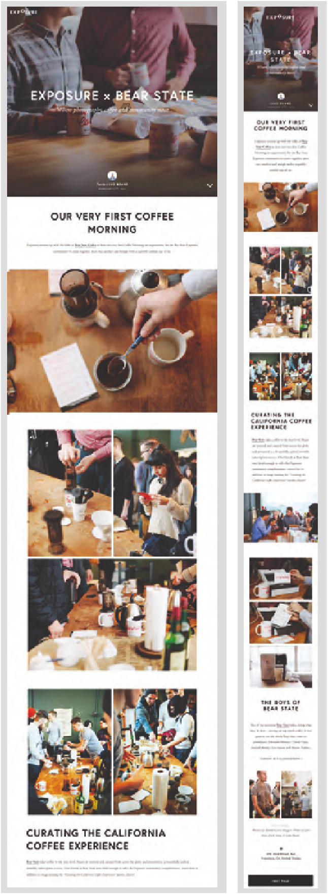
The layout and
typography of the
website Exposure.so
change in response to
different screen sizes.
Responsive design
In response to the differences in programming,
layout, and complexity of information that
exist among mobile phones, tablets, and
desktop computers, a hybrid strategy known
as responsive design is now in practice.
On-screen design and typography “respond”
to the screen size they are being viewed on,
fitting content into the frame for each device
(Fig.
7-27
). The advantage of this technique is
that a single code base is used for all display
sizes, simplifying the coding and unifying the
design from device to device.
Virtually all aspects of typographic
layout and design can be varied in response
to a specific screen size. Visual and interface
elements can also be removed or reordered to
best utilize the communication potential of
the specific device.
Responsive design is especially
challenging since the designer must plan to
display information in a variety of layouts that
best suit the screen size. For example, content
may be designed in a one-column layout for
a mobile phone screen, while a multicolumn
layout may be be more appropriate for a
desktop computer with a wider screen.
Designers also anticipate the different ways
users interact with information, such as
touching a mobile device or using a mouse or
trackpad on a desktop.
Typographic media continues to develop
rapidly, and designers must keep abreast of
innovations that influence the design process
and the typographic image. Having now
assumed almost all of the typographers' role,
designers must develop specialized knowledge
of the typesetting system they are utilizing in
order to fully understand its capabilities and
achieve the desired quality of typographic
communication.