Graphics Reference
In-Depth Information
SCREEN-BASED TYPOGRAPHY
7-25
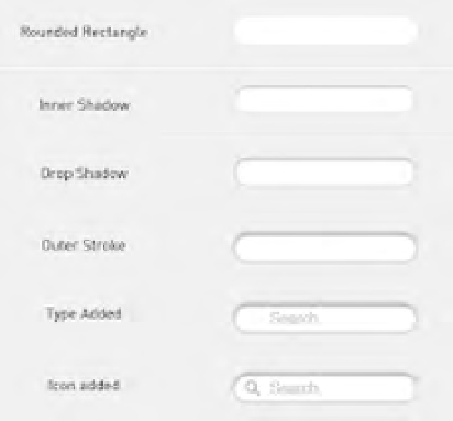
A deconstruction
of all the elements used
to build typography that
signifies interaction.
(Design: Tim Collins)
With electronic communication, typography has evolved from static,
printed output to dynamically created and distributed information
viewed and interacted with entirely on screen. As in printed
typography, screen-based typography is used to communicate and
convey information in many different mediums.
Mobile apps
With the launch of the App Store in 2008, Apple set in motion the next
great advance in on-screen typography. Apps (short for
applications
)
are self-contained programs that perform specific tasks. While they
have existed in a variety of formats since the introduction of the
personal computer, their relative ease of creation, the ready-made App
Store distribution network, and a fixed format established this latest
iteration as a screen-based medium. Originally designed for mobile
phones, mobile apps are now utilized by tablets and even by desktop
computers.
Mobile apps are generally developed utilizing a software
development kit (SDK) that governs the platform they run on. This
SDK contains not only programming instructions but also interface,
design, and even typography specifications. App designers can depart
from these guidelines, but on their own these standards establish
a typographic cohesion and ready-made hierarchy of information.
Typography for mobile apps is influenced by a fixed screen size that
responds to touch and gestures performed by fingers (Fig.
7-26
).
Web
With more than twenty years of typographic development and technical
improvements, the web is the most robustly explored and documented
application of screen-based type. Early browsers confined type to a
single, vertical column of running text, so typesetting was limited
to expressing the importance of text through only size, weight, and
posture. As the use of the web increased, more sophisticated layout
and typeface choices were developed. Complex column arrangements,
broad typeface choices, layering, and rotation became possible as
browsers and coding became vastly more powerful. Today's screen-
based typographic designers now have almost as broad a palette as their
counterparts in print (Fig.
7-24
).
Web typography is meant to be not only read but also engaged.
This can take the form of links, which allow site users to load new
pages or access additional information, or other interface components
that allow further interaction with content (Fig.
7-25
). This act of
engagement has grown in importance as websites have moved from
presenting relatively static information on screen to encouraging user
participation while dynamically assembling the content.
7-26
The Rechner
Calculator app uses
gestures in place of
buttons for controlling
calculations. (Designer:
Berger & Föhr)