Graphics Reference
In-Depth Information
6-23
Verbal/visual
correspondence: The
visual qualities of the
typeface chosen for
the poster for the play
Working
make direct
reference to the stenciled
typography typically
seen at a warehouse
or construction site.
(Designer: David Colley)
6-18
Form combination: Visual and verbal signs
are combined into a single typographic statement,
creating trademarks that suggest the nature of various
industries: an electrical contractor, a maker of plastic
fibers for carpets and draperies, and a lithographic
printer. (Designer: Don Weller)
6-24
Verbal/visual correspondence: The visual
repetition of this word—unified by the shared letters
u
and
n
—express the concept of unity. (Designer:
Steff Geissbuhler)
6-19
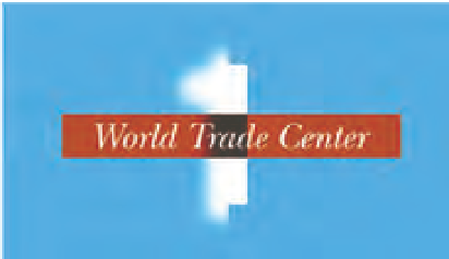
Form combination: Verbal signs are combined
with visual signs (skyscraper and clouds) to evoke
concepts of memory, opposition, and incompleteness
as metaphors for the building 1 World Trade Center.
(Designer: Mark Sanders)
6-21
Verbal/visual correspondence: The syntactic
qualities of the number
2009,
used on a holiday card,
represent the material qualities of ribbon and the idea
of celebration. (Designer: Q Collective)
6-22
Verbal/visual correspondence: The visual
characteristics of this typographic sign correspond to
the form of a zipper. This is achieved by a repetition
of letters and a horizontal shift within the word.
(Designer: Richard Rumble)
6-20
Parallel form: The Olivetti logotype
and electronic calculator have similar visual
characteristics that parallel each other. (Logotype
design: Walter Ballmer)