Graphics Reference
In-Depth Information
ABA form in typography, as in music,
is based upon a fundamental three-part
structure where two repeating parts are in
correspondence, and a third contrasting
part stands in opposition (Fig.
5-58
). This
fundamental structure, however, may
be found in abundant variation. This is
true because contrasting and repeating
typographic elements within a composition
are governed by the dynamic principles
of proportion and rhythm. It is via these
principles that ABA form grows in complexity
and diversity. By definition, proportion
in ABA form is the ratio determined by
the quantity, size, weight, texture, tone,
shape, color, or other syntactic quality of
similar and dissimilar typographic elements
(A
A
BA
A
BA
A
). Rhythm is established in the
intervals of space separating these elements
(A
A
. B . A
A
. B . A
A
).
When typographic elements are
similar in size to one another, an immediate
correspondence between these elements is
established (Fig.
5-59
). This correspondence
is heightened because the tonality of the
photograph and small text block is darker than
the tone of the larger text block. In the middle
diagram, the correspondence between the
smaller text blocks is also magnified (Fig.
5-60
).
A third variation is created by altering the tone
of the elements: a bold typeface is introduced
in the smaller text blocks, linking them
together. Here, the factors of both scale and
tone establish a distinct pattern of repetition
and contrast (Fig.
5-61
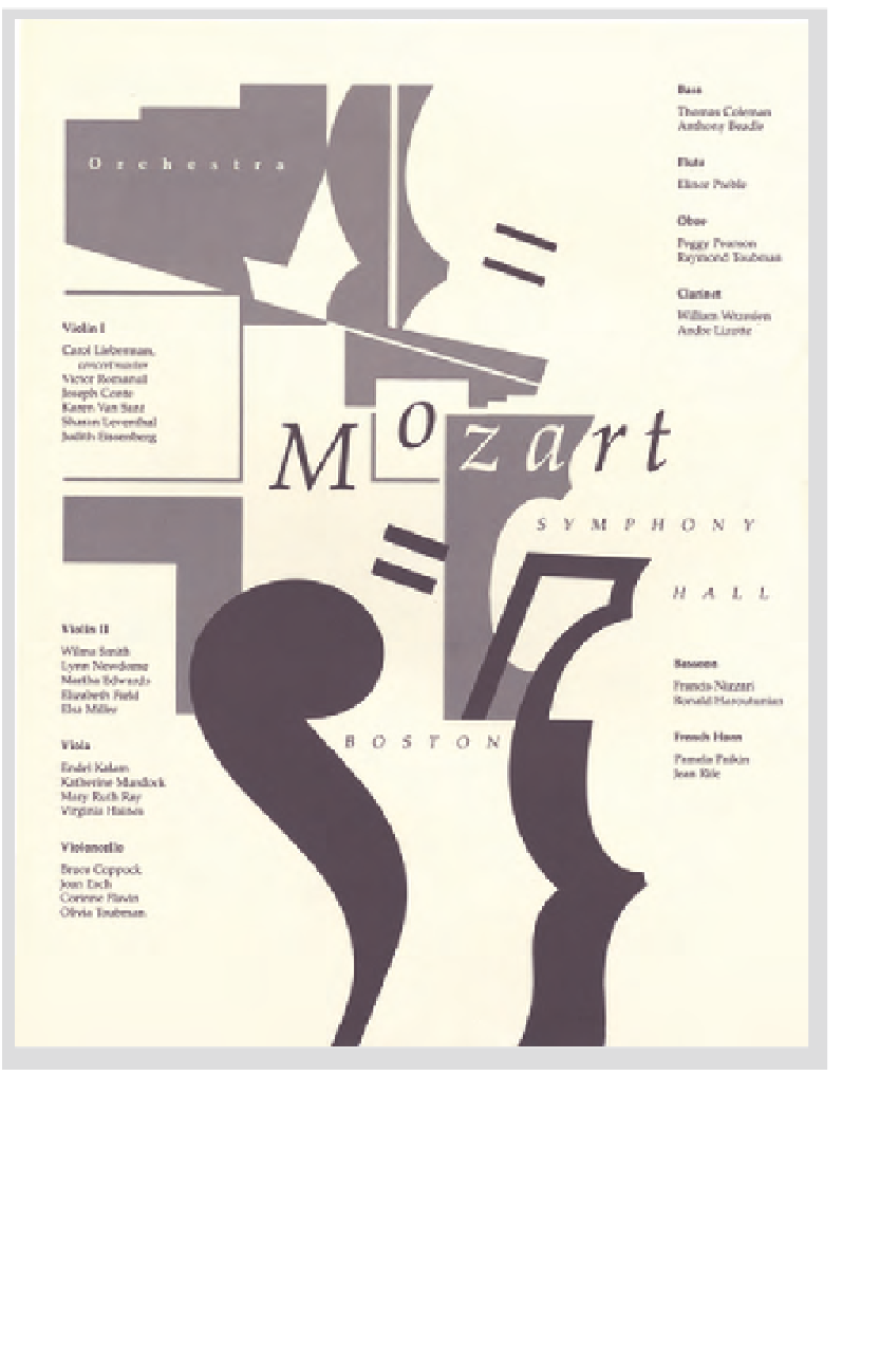
). In an applied
example—the design of a concert poster—the
recurrence and contrast of typographic tone
and texture are demonstrated (Fig.
5-62
).
a
b
a
b
a
A
B
A
5-62
This poster is zoned into three spatial corridors:
two columns of text, finely textured and light in tonal
value, flank a dynamic arrangement of music-related
visual signs, coarser in texture and darker in tone.
(Designer: Ben Day)