Graphics Reference
In-Depth Information
5-53
In these
typographic exercises,
rules and space intervals
are used as visual
punctuation. (Designers:
Bryan Leister and
Rebecca Lantz)
The Whole Duty of Beautiful Typography
The whole duty of Typography, as of
calligraphy, is to communicate to the imagination,
without the loss by the way, the thought or
The whole duty of typography, as of
calligraphy, is to communicate to the
imagination, without loss by the way,
the thought or image intended to be
communicated by the author. And the
whole duty of beautiful typography is
not to substitute for the beauty or
interest of the thing thought and
intended to be conveyed by the
symbol, a beauty or interest of its
own, but, on the one hand, to win
access for that communication by
to win access for that com-
munication by the clearness
and beauty of the vehicle,
and on the other hand, to take
advantage of every pause or
Of all the achievements
of the human mind, the birth of
the alphabet is the most momen-
tous. “Letters like men, have
now an ancestry
the thought or image intended to be
communicated by the author. And the
whole duty of beautiful typography is
intended to be communicated
by the Author. And the whole
duty of beautiful typography is
not to substitute for the beauty
or interest of the thing thought
and intended to be conveyed
by the symbol, a beauty or
interest of its own, but, on the
one hand
Visual
Punctuation
The whole duty of typography, as of
calligraphy, is to communicate to the
imagination, without loss by the way,
Typography:
T
y
p
o
g
r
a
p
h
y
and the ancestry of
words, as of men,
is often a very noble
possession
Some typographic designs are seen from different distances
(far, middle, close). The viewer's perceptions are greatly influenced
by shifts in the viewing experience. Attention to visual hierarchy
and the perceptual environment is vital in graphic media (signage,
posters, and exhibitions) where the viewing experience is in constant
flux (Fig.
5-57
).
Typography's hierarchical order derives from the basic process
of pattern-forming found in nature, in verbal and written language,
the arts, and computer technology. This is aptly described by Gyorgy
Doczi, speaking of his research on proportional harmonies in art and
design: “The rhythms of writing are created by the same pattern-
forming process of sharing that creates rhythms of dance, music, and
speech. Movements shared make dance, patterns shared make music
and speech.”
The shared patterns of typography find expression through
visual dynamics that enable it to function as both a message-carrier
and a rhythmic, visual structure. The typographic message, with all
its limitless thought and diversity of form, is shaped by this subtle
and meaningful hierarchical language.
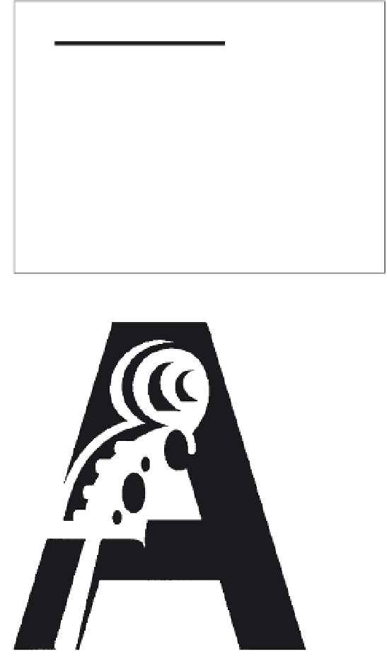
5-55
This symbol
demonstrates visual
accentuation. Striking
visual contrast is
achieved through the
opposition of straight and
curved edges and shapes.
(Designer: Nick Schrenk)
5-56
A mark's unity is dramatically enhanced as
typographic joinery becomes more refined. (Designer:
Paul Rand)
5-57
In this signage for NASA, viewing context determines the visual hierarchy.
For example, the size and position of the arrow in the interior directional signage
are quite different from the size and position of the roadside signage. (Designer:
Danne and Blackburn)


