Graphics Reference
In-Depth Information
5-38
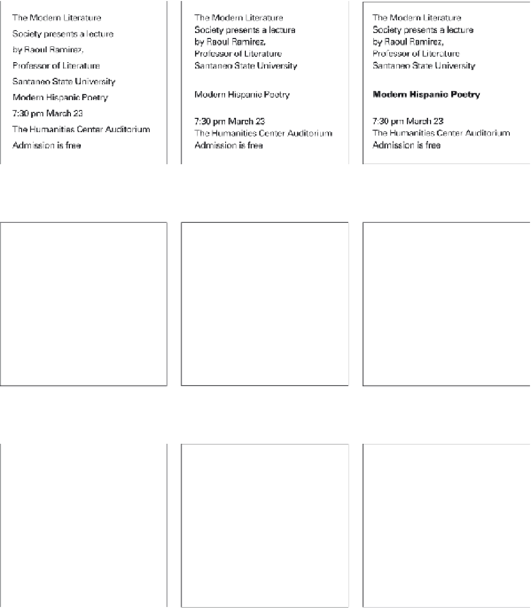
Type style, size, color, weight, and
spacing are consistent, resulting in an even
texture and tone. Visual hierarchy is almost
nonexistent in this arrangement.
5-39
A spatial interval equal to one line
space separates the title from the other
information, giving it prominence in the
composition.
5-40
Setting the title in bolder type further
separates it from the overall tone and
texture, increasing the hierarchical contrast.
5-41
Changing the size and weight of the
title makes it even more prominent in the
visual hierarchy.
5-42
Color or value can create another
level of contrast that can be controlled by
the designer to create hierarchy.
5-43
Two sizes and three weights of type
are used to create subtlety and variety
within the composition.
5-44
The diagonal position of the title
increases its prominence in the space.
The smaller type elements align with the
diagonals of the title's baseline and posture,
unifying the composition.
5-45
This composition demonstrates how
extreme contrasts of type size and weight
increase visual hierarchy and legibility
from a distance.
5-46
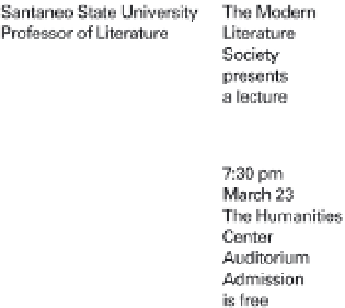
Reversing the title from a black
rectangle heightens contrast and increases
the visual hierarchy. A ruled line separates
the secondary type into two zones of
information.
5-38a
5-39a
5-40a
5-41a
5-42a
5-43a
5-44a
5-45a
5-46a