Graphics Reference
In-Depth Information
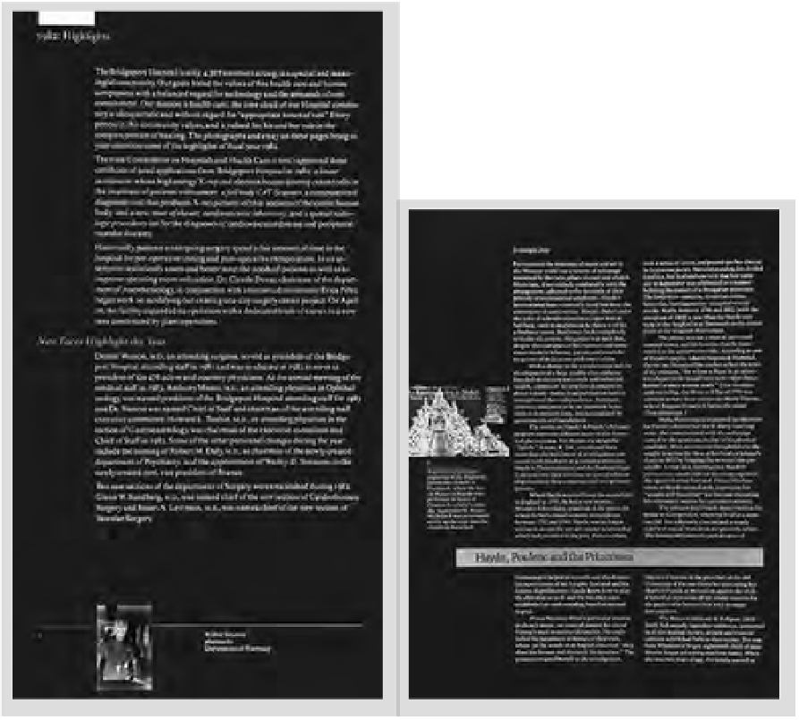
The one- and two-column arrangements
shown in Figures
5-21
and
5-22
illustrate
some of the possibilities for text-column
placement. In the two-column arrangement,
the column depths are equal. Vitality and
contrast are achieved by the placement of the
adjacent photograph, its caption, and the bar
rule containing the title. In both examples, the
caption-column width and the text-column
width are of different lengths, providing
sufficient contrast to indicate to the reader
that the caption is not part of the text. Such
contrasts in column size, shape, texture, and
tone are used to distinguish between different
kinds of information and to provide visually
luminescent pages.
Figure
5-23
is another example of
how columns contrast with one another.
Differences in the columns are produced by
changing the interline spacing and the size
and weight of the text type. Relative to one
another, the columns can be seen as open or
closed, light or dark.
The difference in tonality, which is an
important design consideration, hierarchically
leads the eye from one element to the
next, and finally into the white of the page
(see “Visual Hierarchy,” pp. 100 - 105). The
critically determined spatial intervals create
an engaging visual rhythm.
The size of type may vary from column
to column (Fig.
5-24
) or within a column (Fig.
5-25
). As indicated in the latter diagram, type
that is larger or heavier in weight appears
more dense and is therefore emphasized on
the page. Changes in density provide a kind
of contrast that makes it possible to balance
various typographic elements and add
rhythmic qualities to the page.
The scale and proportion of columns,
intervals between columns, and margins and
their relationships to one another must be
carefully adjusted as determined by the kinds
of information they support. In Figure
5-21
,
generous, unequal margins frame a single
column of quiet text type for a hospital's
annual report, while in Figure
5-19,
narrow
margins surround narrow columns for an
efficient-looking publication.
5-21
In this annual report there are subtle spatial
relationships. These include the form/counterform
of the column to the margin; the placement of the
heading and subheading, which extend into the
margin for emphasis; and the column mass to rules,
photograph, and caption. (Designer: Frank Armstrong)
5-22
This magazine page exhibits the needed
contrast between text and caption elements. The
column width of the text is double the column width
of the caption. (Art director: Ben Day; designer:
Anne Stewart)
5-23
This experimental
text composition reveals
various combinations
of typographic texture
and tone.