Graphics Reference
In-Depth Information
Typographic rules are used in conjunction
with type and separate one line of type from
another or one group of typographic lines
from another as in Figure
5-12
, or in footnotes.
Rules are found in a variety of forms (Fig.
5-17
)
and in numerous sizes and weights. (The use
of visual punctuation, including typographic
rules, is detailed under “Visual Hierarchy,”
pp. 100 - 105.)
Earlier, we discussed kerning and the
optical spacing of letterforms. Control of
these factors makes possible a judicious
use of letterspacing in a line of type. The
orientation of lines raises a multiplicity
of other spacing concerns; for example,
interword spacing, interline spacing, and
line-to-page relationships, as well as the
establishment of columns and margins.
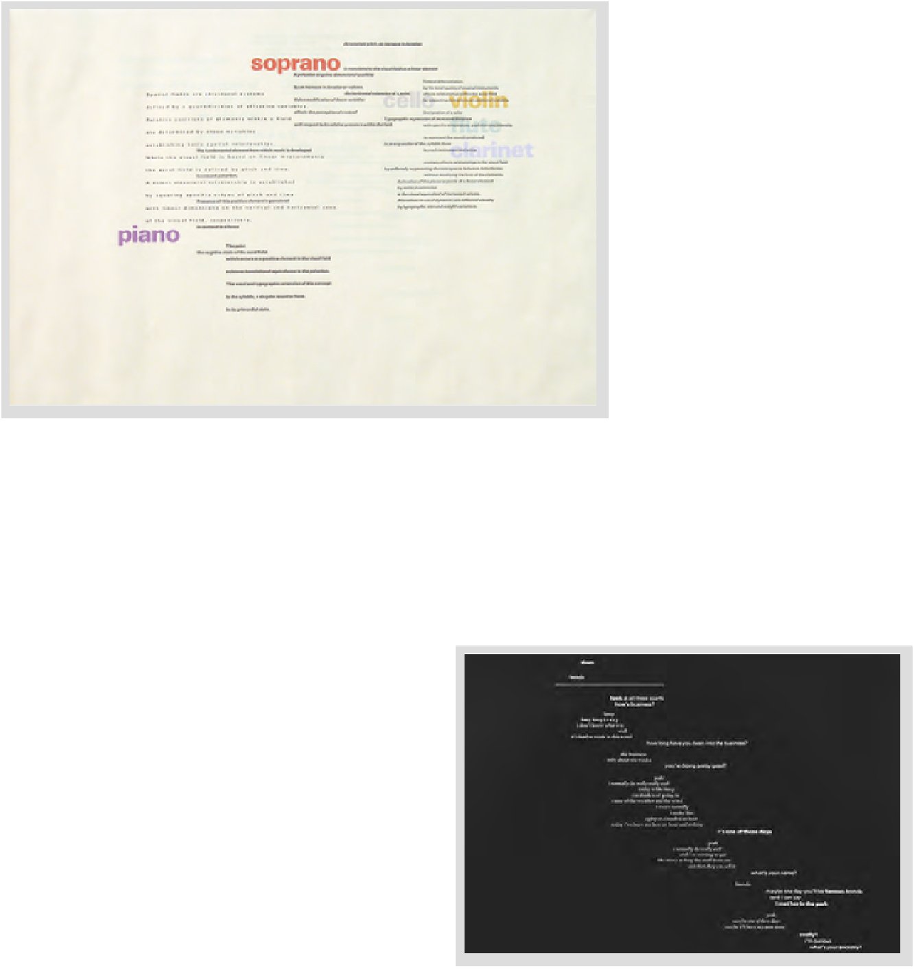
5-14
Complex and subtle relationships in interline
spacing are achieved here by varying type size, weight,
and spatial intervals, which separate the statements
for the reader. The overall effect is rhythmic and
expressive. (Designer: Frank Armstrong)
Straight-line rule
Bar rule
Bracket rule
Swelled rule
Oxford rule
Leader
5-16
In the top setting the lines are flush left, but
the edge appears uneven because of the punctuation.
In the bottom version, hanging the punctuation into
the margin is an adjustment resulting in an optically
aligned edge.
5-17
Hierarchical
clarity can be established
by using this standard
collection of typographic
rules to separate,
emphasize, and bring
order to parts of
information.
5-15
In this conversation, the placement of lines
and intervals reflects the dialogue. (Designer: Warren
Lehrer)