Graphics Reference
In-Depth Information
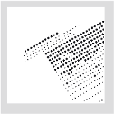
5-13
This multiple-
line composition
contains varying line
weights, yet expresses
wholeness through the
careful placement of all
elements. It displays the
diversity possible in the
spacing of lines of type.
(Designer: Wolfgang
Weingart)
The line
Words are joined to form verbal sentences
and typographic lines. The configuration
and placement of lines of type are significant
structural concerns. In its most basic form, a
line of type consists of a single point size and
a single weight extended horizontally over a
specific line width.
Lines of type can be arranged
symmetrically (Fig.
5-10
), or asymmetrically
(Fig.
5 -11
). The viewer/reader must sense
a clearly established relationship between
individual lines of type and the surrounding
space (Fig.
5-12
).
The smallest change in point size, weight,
or line length controls the overall emphasis
given to a line of type. The designer or
typographer must determine when the overall
effect is balanced and fully integrated. All
design considerations—typeface selection,
alignments, and spacing—should display
connections that are apparent and distinct (Fig.
5-13
). Jan Tschichold states, “The relationship
of the sizes must in any case be clearly visible,
its effect must be lively, and it must always
follow the sense of the text exactly.”
The length of a group of lines of type can
be equal (justified), unequal (flush left/ragged
right, ragged left/flush right), or centered. The
examples in this section illustrate various
typographic alignments. Typographic form
becomes lively and harmonious through
these alignments, which enhance individual
lines of type and activate the surrounding
space (Figs.
5-14
and
5-15
).
The placement of punctuation marks is
of special significance to these alignments. In
Figure
5-16,
punctuation marks extend into
the margin. Slight adjustments and subtle
refinements heighten the degree of unity.
5-10
Symmetrical
placement produces
a quiet, balanced
configuration.
5 -11
Asymmetrical
placement achieves
a dynamic division
of space on the page.
(Designer: Ivy Li)
5-12
Type and rules
combine to bring a sense
of unity to the page.
Note the recurrence of
similar space intervals
and the attention given
to individual line breaks
(the rhythmic pattern of
line endings). (Designer:
Cheryl Van Arnam)