Graphics Reference
In-Depth Information
The word
By definition, a word has the potential to express an idea (Fig.
5-6
),
object, or event. Word signs are independent of the things they represent,
yet by design they can be made to signify and reveal their meaning.
Form and counterform relationships, found within individual
letterforms, also exist within individual words. Speaking on the
structural consideration of form and counterform and the designing
of typefaces, Adrian Frutiger stated, “The material of typography is
the black, and it is the designer's task with the help of this black to
capture space, to create harmonious whites inside the letters as well as
between them.”
By observing this principle and by combining form and
counterform into word units, the designer discovers subtle
typographic connections and rhythms (Fig.
5-7
). The word unit is
a constellation of individual letterforms, suggesting a union and
forming a cohesive whole. Optically adjusted spaces and consistent
counterform relationships assure the overall clarity of this union.
Discussing interletter spacing, the painter and graphic artist
Ben Shahn tells about his training as an apprentice who lettered on
lithographic stones in 1913. The shop foreman explained, “Imagine
you have in your hand a glass that will hold only so much water. Now
you must provide space between your letters—whatever their slants
and curves may be—to hold just that much water, no more or less.”
The universal principle for spacing letters is this: the typographer,
calligrapher, or designer attempts to make the interletter space
between each pair of letters appear equal to the space between every
other pair of letters. Because these counterform spaces have such
different configurations, this spacing must be achieved through optical
balance rather than through measurement.
Figure
5-8
shows a dissection of the word
Camerata
, displaying
various interletter relationships, including both geometric and organic
features. In this example, the word's internal pattern is created by
the visual properties of the individual letterforms and their various
juxtapositions. This arrangement displays the nature of the internal
pattern.
Camerata
is an Italian word meaning “a room full of people”;
this meaning supplies yet another interpretation of the overall pattern.
A concern for form and counterform is evident in the equilibrium
that is established among the letterforms comprising the word
Camerata
.
It is extremely important to see the interior rhythms of a single word.
In the example shown, the letters
C
,
m
,
r
, and
t
function as elements of
contrast, while the three
a
's and the
e
act as the unifying elements. A
similar use of contrast and repetition is demonstrated by the progression
of letterforms within the corporate logotype for Olivetti (Fig.
5-9
).
Obviously, not all words offer the potential for such a rich
typographic internal pattern. The complex and lively forms reproduced
here clearly show the variety and fullness of form that exists in some
deceptively simple word units.
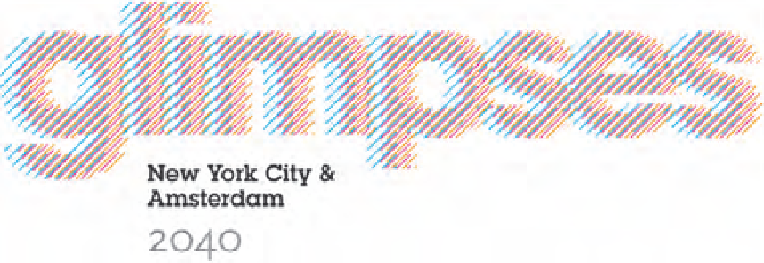
5-6
Three colors of
overlaid letterforms
composed of diagonal
lines combine to form
a sign for the word
glimpses
. The word's
meaning is expressed
visually and poetically.
(Designer: Q Collective)