Database Reference
In-Depth Information
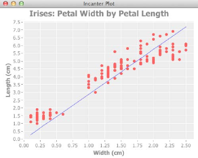
Once we've added that, our chart resembles the following screenshot:
How it works...
The itted values for the linear regression are just a sequence of
y
values corresponding to the
sequence of
x
values. When we add that line to the graph, Incanter pairs the
x
and
y
values
together and draws a line on the graph linking each point. Since the points describe a straight
line, we end up with the line found by the linear regression.
See also
F
The
Modeling linear relationships
recipe in
Chapter 7
,
Statistical Data Analysis
with Incanter
.
Customizing charts with JFreeChart
Incanter's chart API is easy to use and provides a powerful wrapper around JFreeChart
variety of chart types or all the options that JFreeChart provides. In order to access those,
we have to dive from Incanter's API into the JFreeChart objects. Fortunately, that's quite
easy to do. Let's see how.