Java Reference
In-Depth Information
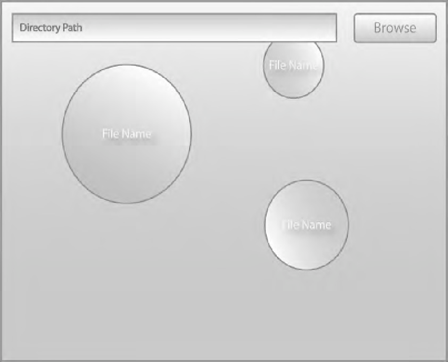
Figure 1-7.
Design mock-up
Figure 1-7 shows the design from the experienced designer realized with color. The graphical
designer was directed to make the application friendly, so he opted for thick lines and pastel colors.
From a developer's perspective, I would ask these questions of the graphical designer.
•
What is the proportion used on the gradients?
•
Is the direction of the gradient random or driven by something else?
•
Are these all of the colors we should use or are they just examples?
The path field is overlapping one of the files, is that what we really want?
While there is a still a lot of work to be done on this application, the basic framework is in place.
Most importantly, questions about how the app works and looks were asked early. Of course,
development issues do arise: maybe we can't get the layout of the circles just right. In this case, hopefully
the issue was identified early in the development process, allowing the design team to rethink the
feature.
•