Database Reference
In-Depth Information
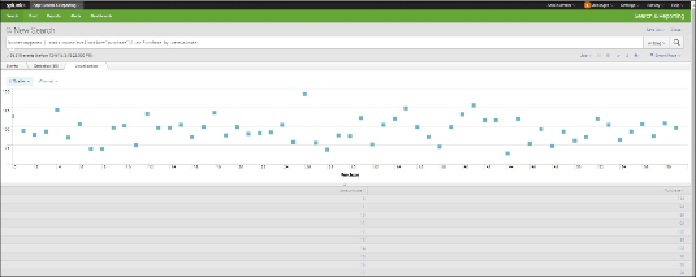
Creating a scattergram
A scattergram is useful for comparing values for two fields. It can sometimes pick up cor-
relations between fields. A positive correlation can be seen when a scattergram goes from
the bottom left to the top right; a negative correlation from top left to bottom right. A scat-
tergram can also show the spread of variation. If points are tightly clustered around an ima-
ginary line in a positive direction, we can intuit a strong positive correlation. Likewise, if
they are tightly clustered around an imaginary line in a negative direction, we suspect a
strong negative correlation in the underlying data. In our example here, we are not looking
for a correlation, but just observing a pattern in the data.
To create a scattergram, take the following steps:
1. Put the following code in the search bar:
buttercupgames | stats count(eval(action="purchase"))
as Purchase by date_minute
2. Look at your results on the
Statistics
tab. It is hard to see a relationship between
the counts of purchases and minutes.
3. Click the
Visualizations
tab.
4. Click the icon in the upper-left corner and select the
Scattergram
chart.
5. Your chart will now show each purchase by minute over time.
Scattergram Chart