Graphics Reference
In-Depth Information
Text box
(
Figure 2.12
) usually represents a name value. Click inside the box to change the text.
Panels
(
Figure 2.13
) are found throughout the interface. They act
as containers for other sets of controls. A panel can be collapsed
and expanded by clicking the triangle to the left of the name.
By clicking and dragging on the title area, panels can be dragged
to new locations within their own window, causing other panels
to shuffle out of the way and rearrange.
Toggles
(
Figure 2.14
) are visualized as checkboxes in Blender. They
are either “on” or “off.” Checkbox toggles are always indepen-
dent of one another. Even if you see them in clusters, they will
not act like radio buttons. You can enable and disable them
individually.
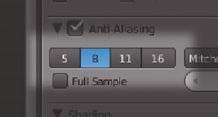
Buttons groups
(
Figure 2.15
) are groups of mutually exclusive
buttons. Only one of them can be active at a time. In the default
theme, the active option of the group is colored blue.
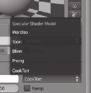
Figure 2.11
Pop-up menu.
Figure 2.12
Text box.
Figure 2.13
The “Transform” panel.
Figure 2.14
Toggles.
Figure 2.15
Buttons group.

Search WWH ::

Custom Search