Graphics Reference
In-Depth Information
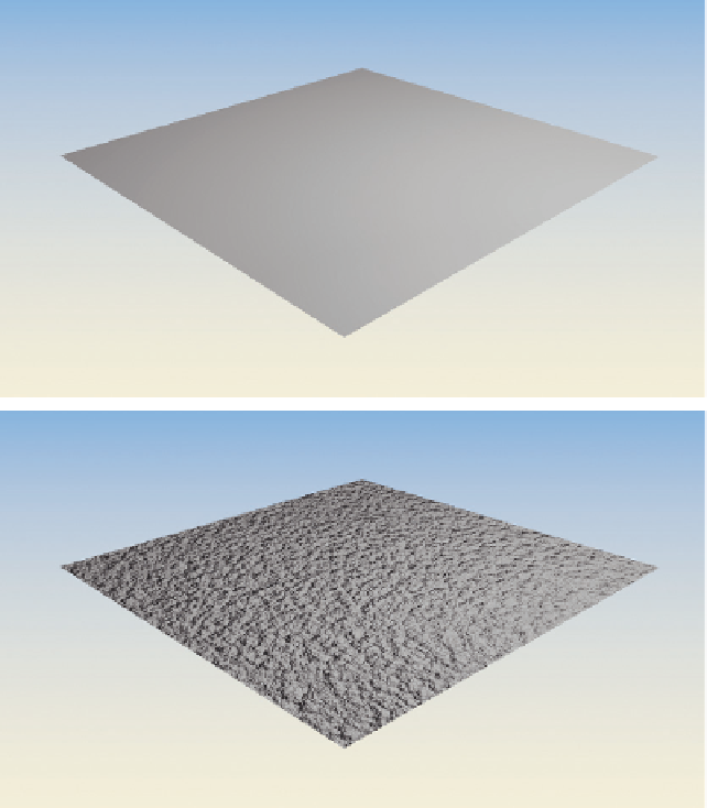
depth should you add to your
normal variation? Let obser-
vation of the real world be
your guide. The real triumph
will be an image that clicks
inside your viewers' head.
For the example scene, I've
settled on a low value (0.010)
for the normal variation with
the wall texture. You can just
make it out in a high-resolu-
tion render, or where the
camera is closer to a wall. It's
not overpowering. It doesn't
scream “Look at me! I'm a
wall!” It just sits there and
does what walls are supposed
to do: feel like a wall.
How do you know when you
have your material and texture
properties just right? The
only real way to tell is to
render them, applied to your
objects, with the lighting that
you determined in Chapter
5. The lighting (hopefully)
looked good without any
additional surfacing, so we
know it's correct. This means that the surface properties of our objects must look correct in that lighting.
If you've observed your references carefully, then your texture will look right within the lighting scheme
that you've chosen. And, since you've chosen your lighting based on careful observation as well, your
materials should actually be semi-portable, meaning that they will look appropriate in a variety of reality-
based lighting schemes.
Figure 7.9
The effect of varying the surface's normal value.
Adding a Second Material and Using Image Textures
The floor. It's a bit ugly, textured like the walls. Let's throw some carpet down there using an image
texture. First though, we need some way to apply a separate material to the floor.
Back in the 3D view, make sure that the room is selected and enter Edit Mode with the Tab key. Choose
Face select mode on the 3D header and make a selection that consists of only the faces of the floor. On
Search WWH ::

Custom Search