Graphics Reference
In-Depth Information
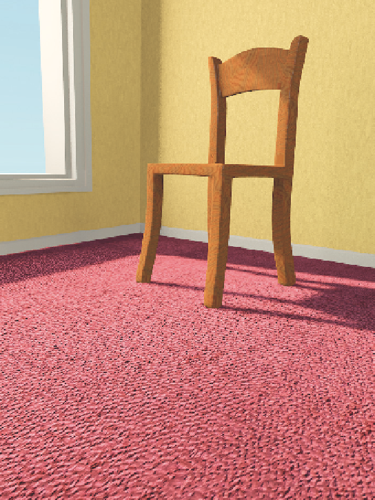
a carpeted floor. Unfortunately, the
carpet texture is applied at an unrealistic
scale, ruining the illusion of reality. It's
not horribly wrong, but wrong enough.
As you choose and generate your tex-
tures, make sure that they are in
the correct scale. The best way to do
this is to observe reference images (or
the real world, if you have it handy)
and compare them to your own test
renders, paying
specific attention
to
texture scale.
Turbulence
“messes up” the texture.
The more you add, the more random it
becomes. How much turbulence do you
need? Once again, you should know
where you're headed. Set it 0.0 and
observe. Then max it out (1000.00 in
most cases) and see where that gets
you. Your solution will obviously fall
somewhere between the two, and the
near-real-time preview will help you to
find it.
The last panel that directly affects the
image is
Colors
. You can see the famil-
iar RGB controls here, but they only
work with texture types that have color
information to begin with. Only Image,
Magic, and Clouds make use of them. Even then, the set of RGB sliders is the crudest of tools,
suitable to a last-minute push toward a certain color cast. If you really want to colorize something
or otherwise adjust it, you're better off doing it another way. The
Brightness
and
Contrast
controls,
however, work with all of the texture types. Increasing brightness pushes the entire texture toward
white, while decreasing it pushes toward black. Decreasing contrast tends the texture toward neutral gray.
Raising contrast makes the differences between dark and light portions of the texture more stark. These
controls should also be used with care, as they can result in texture values outside of the normal range
(think of a perfectly white texture with a raised brightness) that can in turn produce unexpected “burned
out” spots in your resulting material. My advice is to use the RGB, Brightness, and Contrast controls
sparingly.
Figure 7.6, cont'd
Search WWH ::

Custom Search