Graphics Reference
In-Depth Information
In that same panel is the
Intensity
control. This slider
controls how much of the incoming light is reflected. In
the real world, nothing reflects 100% of the light that hits
it. Manufactured white items like plaster and paint will have
the highest reflectance, getting as high as 0.9 (i.e., 90%).
The Web Bucket contains a text file (
common relectance.txt
)
with reflectance ranges for some common classes of materi-
als. In general, the rougher the surface, the lower this value
is going to be. The roughness in question isn't the large-
scale roughness of the bark of a maple tree, but on a smaller
scale, like the finely pitted surface of sidewalk concrete.
We'll revisit this value as we work through the different
objects in the scene.
In addition to Intensity, this panel also has a
Color
swatch
control, just like the lamp controls discussed in Chapter 5.
Once again, almost nothing is perfectly white. Even a
painted white wall or paper will have a slight color cast to
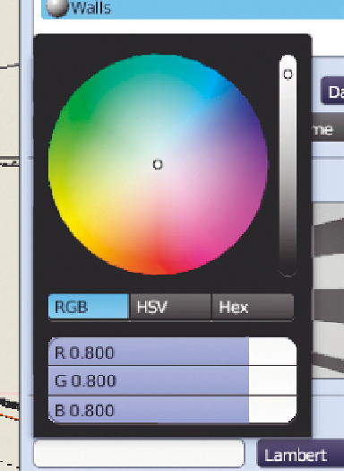
it. LMB clicking on the color swatch brings up the color
picker, which is highlighted in
Figure 7.2
. The black/white
slider on the right selects for overall brightness, while the
hue and saturation can be selected within the color circle
itself. Of course, you can set colors using the RGB sliders at the bottom, but I don't recommend it. In
fact, I generally change from RGB (red, green, blue) to HSV (hue, saturation, value) controls. Why? I
find that it's fairly easy to obtain the general color you need by using the visual controls (black/white +
color wheel). Then, I use the HSV controls, mostly the S (saturation), to make the color more realistic.
This is a place where careful observation will pay off. Yes, that vase in your scene might be red, but how
red is it really? Do not oversaturate your colors. Real life is, for the most part, lacking in saturation. Pull
that S slider to the left, just a little bit past where you think it ought to be.
Figure 7.2
The color picker.
At this point, it doesn't matter if your object has a complex color scheme. The color you pick here serves
as a base for everything else that you do, so choose a color that represents what you think the object
would look like if it were evenly lit and heavily blurred. It also sets the color of the object when drawn
in Solid mode in the 3D view. In our example scene, the walls are set to a dull, light mustard color,
because white walls are boring (R = 0.70, G = 0.62, B = 0.28).
The next panel is titled
Specular
. Specular is a trick that 3D renderers use to represent the real-world
phenomenon of being able to see an often diffused reflection of a light source on a surface. Changing the
Specular Intensity between 0.0 and 1.0 will show you the effect immediately in a spherical material preview.
The abuse of specular highlighting is one of those things that instantly identifies an amateur image. It's
there, and the default Intensity is 0.5, so people figure “That must be good, right?” Well, it isn't. Start by
just turning it off completely—Intensity to 0.0.
Search WWH ::

Custom Search