HTML and CSS Reference
In-Depth Information
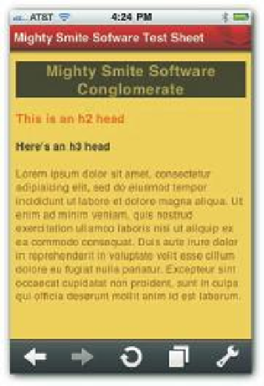
In setting up the CSS3 i le, the only setting that specii cally targeted mobile devices is the
width
setting in the
body
element. It's set to 480px because that's the width of the iPhone
used in testing. However, depending on how users hold their mobile devices, they'll get
dif erent results. Figures 3-9 and 3-10 show what the page looks like when the phone is held at
dif erent angles.
57
Figure 3-9: Style set for mobile device vertical.
Figure 3-10: Style set for mobile device horizontal.