HTML and CSS Reference
In-Depth Information
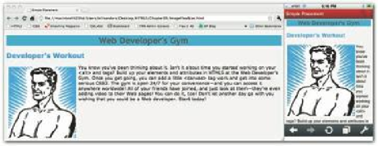
Figure 9-13: Different views of a page.
FLEXIBLE IMAGE SIZE WITH A LITTLE JAVASCRIPT
In Chapter 12, you'll understand this information better, but I need JavaScript in this section
to show how your pages can be more l exible by having dif erent-size images. JavaScript has a
little property called
navigator.appVersion
. When that property is placed into a script,
you can i nd out information about the hardware being used to load the Web page. If you i nd
out that the page is being loaded into a mobile device, instead of loading the full-size image
into the Web page, it loads the smaller one.
To make this work, take the same GIF i le used for the original Web page created in the
previous section, and make a second one about one-third the size of the original. Create a
folder, and name it
flexImages
, and place both the large and small GIF i les. Name the
large i le,
WebDeveloper.gif
and the smaller one
lilWebDeveloper.gif
, and place
them both in the
flexImages
folder. h en enter the following program (
ImageFlex
Size.html
in this chapter's folder at
www.wiley.com/go/smashinghtml5
) and save
it in the same directory as the
flexImages
folder.
191
<!
DOCTYPE HTML
>
<
html
>
<
head
>
<
script type
=
”text/javascript”
>
var envir
=
navigator
.
appVersion
;
envir
=
envir
.
substring
(
5
,
11
);
var imageNow
=
new Image
();
var showNow
;
function showImage
()
{
if
(
envir
==
”iPhone”
||
envir
==
”(iPhon”
)
{
showNow
=
”flexImages/lilWebDeveloper.gif”
;
}
else
{
showNow
=
”flexImages/WebDeveloper.gif”
;
}