HTML and CSS Reference
In-Depth Information
FIGURE 3.4
Glyphs that don't appear inside your web font will
be rendered in the system default, if you've specified it as a
fallback in your font stack.
FIGURE 3.5
There's nothing worse than seeing horrible blank
spaces in your text! Always specify a fallback font stack, even
if it is just the system default sans-serif or serif font!
If your headings look ghastly, one potential solution is to set the heading font
sizes in pixels just on the problem browsers. This has been known to help. You
could do this via an IE conditional comment perhaps or by using browser sni
ng.
Another tip is that when you generate your
@font-face
kit in Font Squirrel, as
you saw earlier, you should click the Expert option, and then choose Rendering >
Apply Hinting > Improve Win rendering.
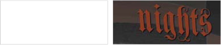
QUALITY AND WIDESPREAD USAGE
Free fonts are all well and good, but the really decent fonts are few and far between.
Many free fonts have a small range of glyphs included in them, which is not too
bad if you are using the glyphs for headings that you can control, but it can be
disastrous if you are using them on user-generated content, like a blog. If you
have specified a fallback font, the characters that don't appear in your web font
will appear in the fallback font. For example, in Figure 3.4 I've replaced the “K” in
Knights in my example's
<h1>
with a registered trademark symbol that doesn't
appear in the GenzschEtHeyseRegular font.
If you don't specify a fallback font stack, certain characters could easily be
rendered as horrible little blank spaces or ugly squares (
Figure 3.5
), because the
web font does not contain those glyphs.